Advertisement

[WIP] bee's flying around doing weird things

Started by July 09, 2014 08:15 AM
3 comments, last by ShadowFlar3 10 years, 5 months ago

I finally decided to give mobile gaming another try. In the past i had bad experience with a popular bomberman clone getting dmca'ed by a japanese company. A lot of work done for nothing, but with hindsight it made sense.

I'm currently in the process of designing a main character for my upcoming bee related game, which involves bee's flying around doing weird things. Can't tell too much :-)

Being mobile tends to hide the fact that i'm not a big 3d modeller, cause in the end the 2d sprite will likely not be larger than 64px.

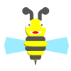
Here is a work in progress. I'll try to post updated pictures in the evening when i've done another rework of the model:

[attachment=22576:bee400.png][attachment=22579:bee400_5.png][attachment=22578:bee400_4.png]

Here is how it looks in game, if not smaller:

[attachment=22577:bee64.png]

Your suggestions and comments are of course welcome.
Sorry to hear about your bomberman project :/ Those things could go one way or the other.

So you're rendering it into 2D sprite(s) eventually? I think the 3D model pretty much wasted effort if you're doing barely shaded isometric front view like in the example. 64x64 pixels is not hard to get right so consider using pure 2D software for making your future assets if they are of that size.

I think why I get mixed feelings of your design is because it uses artistically stylized shape but conventional color scheme. I get it though: shape is hard to replicate (especially in 3D modeling but colors are not. You need to make a decision on your style, is it realistic or artistic?

For realistic-ish style I'd like to see some limbs and more definition in the wings, black eyes and some shading to give it depth.

If you're going for cute toon style then you should also take artistic freedom over the colors and go wild, try pink and lime green in bright or pastel shades, black and white, hot and cold, rocky road cookie dough... you get the point. In the process of thinking the colour schemes also think of how you are going to make the backgrounds and enemies that need to be distinguished from your character.

Advertisement


So you're rendering it into 2D sprite(s) eventually? I think the 3D model pretty much wasted effort if you're doing barely shaded isometric front view like in the example. 64x64 pixels is not hard to get right so consider using pure 2D software for making your future assets if they are of that size.
That would indeed be a good idea, but my 2d sprite is displayed in a top down game, so it must have right, left, top and down view, in addition the little wings are animated including the head, this will hopefully result in a good representation of a flying bee.


I think why I get mixed feelings of your design is because it uses artistically stylized shape but conventional color scheme. I get it though: shape is hard to replicate (especially in 3D modeling but colors are not. You need to make a decision on your style, is it realistic or artistic?

For realistic-ish style I'd like to see some limbs and more definition in the wings, black eyes and some shading to give it depth.
I agree, i choose this style because in the game the little details won't be seen, there will likely be a dozen bees flying around. That makes your following point interesting.


If you're going for cute toon style then you should also take artistic freedom over the colors and go wild, try pink and lime green in bright or pastel shades, black and white, hot and cold, rocky road cookie dough... you get the point. In the process of thinking the colour schemes also think of how you are going to make the backgrounds and enemies that need to be distinguished from your character.
Interesting different colors and styles could make the characters stand more out and be more easier distinctable by the players, maybe even add different attributes for each player bee. A bee with a hat, and such.

Cheers for your comments and suggestions on the subject!

Yesterday afternoon i did some work on additional sprites in the game. From different fruits to rocks.

[attachment=22591:apple_400.png][attachment=22592:banana_400.png][attachment=22593:bee_anim_400.png][attachment=22594:cloud400.png][attachment=22595:flower_s2_400.png][attachment=22596:peer_400.png][attachment=22597:rock_400.png][attachment=22598:tree_400.png]

I'm not 100% happy with the cartoon shader, it looks quite flat. I did experience a bit with gradients (see the cloud), i'll continue this this afternoon to see if this makes everything look a bit better.

For a quick tip try increasing the shadow sizes by adjusting lighting so it's more from the side. Try to shade them so that about 1/4 or 1/3 receives shadow. The tree could better if you add some smaller spheres with 1/2 or 2/3 of the current spheres' radius or even a whole lot of sizes like the rocks which look nice.

Also I think worth trying out is how soft shadows would look with this style. The cloud looks nice, but full gradient shading (from specular highlight to shadow) can be harder to manage so that it looks unified if you're not experienced with rendering.

This topic is closed to new replies.

Advertisement