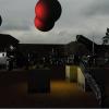
Good work so far! I think you have a really unique style going, but you sill have room for improvement.
I think your real problem is understanding contrast. You need to go farther in defining objects, both by making the objects themselves darker/lighter, but also by toning down stuff that isn't important like the sky and ground. Important things should stand out from background stuff. In your first drawing, contrast was extreme on everything so it was difficult to make out any single detail, but on your second you have the opposite problem- everything is kind of washed out. For example, in your second image the sky is waaaay too close in value to the trees, and in general you have nothing close to white. The upper half of figure on the left however is silhouetted fairly well in comparison. I think looking up some tips on positive and negative space would help, too.
I think you might be better off practicing in grayscale since the colorized look distracts from that, which isn't what you want if you want to get better (but more or less fine if you're making it as a final product).


