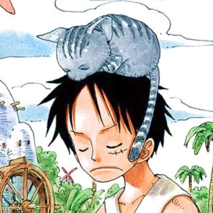
Hi.I'm new here.I want my impressions about my artwork so feel free to give feedback.
These are some that I have drawn before I started taking art classes.
http://i759.photobuc...er/scan0006.jpg
http://i759.photobuc...iter/Dincky.png
http://i759.photobuc.../scan0010-1.jpg
http://i759.photobuc...LusterPurge.png
http://i759.photobuc.../Untitled-1.png
http://i759.photobuc...sshadowform.jpg
http://i759.photobuc.../Untitled-3.jpg
http://i759.photobuc...er/Dincky-1.jpg
Oh and I also started my webcomic series.
see it here
www.stewpidandsmartypanzz.thecomicseries.com
I know I need improvement somewhere but hey I just drew these for fun.And once it struck in my head I can't help but draw it.
Your impressions for my art and design
Maybe I was a little hard in the other post.
This is your best work so far:
http://i759.photobucket.com/albums/xx234/Jackwriter/Dincky.png
The facial expression is good, the eye will have a tendency to zero in on it since it's the best feature of the drawing.. Put the same amount of work you have put in the face in the limbs. I see that you have attempted to do a little shading. You have used brown, try instead a shade of gray or black with some opacity. Let's say you're shading red, use a brick red for shading. For green use a darker green, etc...
This is not too bad either:
http://i759.photobucket.com/albums/xx234/Jackwriter/LusterPurge.png
Take the font in illustrator instead of drawing big letter, that will fix some things.
The cartoon:
http://i759.photobucket.com/albums/xx234/Jackwriter/Untitled-3.jpg
You've put some work in colouring, but there's 2 things. They are small, we cannot appreciate the work much, it's hard what kind of animal the characters are. Zoom in on their body and faces. Also, put some squares around each scenes, like a good old cartoon. Right now, your scenes are like stuff strewn randomly on a floor. Putting squares around it will be like putting everything on shelves. You can overlap the talking bubbles on the squares if you want.
For the rest, color them. Again my motto, Practice, practice, practice!
Ok, with the squares it's better than (http://i759.photobuc.../Untitled-3.jpg). Very very simple design I guess, a lot of cut & paste of character from squares to squares. But no need in arguing about the level for someone who is beginning. You are at the level you are at and that's it. The jokes are ok I guess. I have done some professional manga like stuff, I can tell you quality takes a lot of time. Sometimes, you have to cut some corner to do quantity.
As I said in the other post, nfries88 is giving you an offer, take it! this will allow you to better your style.
As I said in the other post, nfries88 is giving you an offer, take it! this will allow you to better your style.
This topic is closed to new replies.
Advertisement
Popular Topics
Advertisement
Recommended Tutorials
Advertisement


