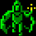
 I''m making a tiny adventure game; this is one of the screens so far
 Some art for my 2D adventure
 I''m making a tiny adventure game; this is one of the screens so far
That looks very cool, the character is a little odd, but with the right animations and some cool expressions it would work quite well I think..
I was just wondering what the little stick man was?
I was just wondering what the little stick man was?
neat art.. what type of 2d game will it be, text/graphics, or king''s quest style?
I would suggest maybe giving him ''shoulders'' and prehaps ''feet'', outlined by the cloak of course. And make his hood more pointy but then that is just me, and it would change the character.. as long as the story line sez he''s a monk I don''t see what the conniption would be..
I fseek, therefore I fam.
I'll give you a beating like Rodney King who deserved it!=====================================Any and all ideas, theories, and text c2004,c2009 BrainDead Software. All Rights Reserved.
yeh thats pretty cool i like it. And the character rocks.
But whats going on with the backdrop. in my opinion you should desaturate the colours there it should appear washed out. Generally with perspective the closer the object to the viewer the more saturated it should be.
But whats going on with the backdrop. in my opinion you should desaturate the colours there it should appear washed out. Generally with perspective the closer the object to the viewer the more saturated it should be.
who stole my signature
quote:
Original post by thedodger
yeh thats pretty cool i like it. And the character rocks.
But whats going on with the backdrop. in my opinion you should desaturate the colours there it should appear washed out. Generally with perspective the closer the object to the viewer the more saturated it should be.
I tried that, and it looked a little too foggy :\. I thought it looked better with more distant objects fading out to a green, instead of a more grey, or simply reducing the saturation.
Wonderful.
Always without desire we must be found, If its deep mystery we would sound; But if desire always within us be, Its outer fringe is all that we shall see. - The Tao
May 22, 2003 11:32 PM
Saturated colors are more common in nature, and console games.
Desaturated colors are more common in decrepit bathrooms, and PC games.
I say: more saturation! More brightness! And keep on drawing!
Desaturated colors are more common in decrepit bathrooms, and PC games.
I say: more saturation! More brightness! And keep on drawing!
This topic is closed to new replies.
Advertisement
Popular Topics
Advertisement
Recommended Tutorials
Advertisement


