*grabs Zonbie by the wrist* *drags em to my dungeon* "you cant leave until you teach me how to do that.
also Valk, great work as always, love that ex girlfreind cg, its beyond beautiful! ... well.. while im at it... *throws Valk in the dungeon too* "same goes for you buster"
Show your 2d sketch/paint styles here!
quote: Must, take, this oppertunity..... to.. show off.
I suck, but i have to.. its in my nature. I will only make people realize how much i completly and utterly suck at sketching but wtf~!
Honestly, it''s not my thing at all (I hate anime, haha) but don''t kid yourself; you have a lot of talent. I only wish I could draw some of the things you did
Peon
***grumble**grumble*** bollocks, you just wait and see. As soon as I get acces back to my account I''ll show off just like always.
Until then here are some samples to show off different aspects of my work (I put links ''coz some of the pics are pretty big, and the regulars here have probably seen them all before) :
[warning]Since I am French, I am entitled to a certain amount of bragging and arrogance (as well as the odd spelling/grammar mistake), but some of our younger viewers might find it irritating, or right down boring. You''ve been warned [warning finished]
*The Khalif''s daughter.
When less is more One of my rare attempts at simplicity, and ink (virtual ink, that is)
*Rose in ink.
One of my better works in the area of "less is more". I really like the watercolour+black ink effect, especially since I am usually pretty poor in those areas.
*Metal night poster.
A "comissioned" work (I like the sound of that) for a mate of mine (the DJ). An interesting exercise since the target medium is low quality photocopied posters (usually).
I particularly like the background texture. I think overdid the ROCK letters a bit too much...
I liked the concept of the headbanger, but I am just not satisfied with the final result (it''s OK, but I just get a feeling it could have been better, and more in tone with the rest).
*Ronin.
My first attempt at scanning/colorizing. I am pretty happy with the result, particularly the little rain effect
Since then I changed my methods, but I still really like this one, I think mainly for the pose, and just the fact that for a "first time", it''s one of the few I can look back at and still be proud.
*Sit on it and rotate.
A scan from a drawing done in class. "Coz I can draw on *paper*, too". I just like to spend hours doing the shading. Sad, sad man.
*Statu quo.
A rare occurence of life in one of my drawings. Most of my work is very static. This one is my pride and joy for dynamic, it''s pretty old, but I never get bored looking at it (pencil, scanned).
*Doll queen.
A more recent work done for my little sister''s enjoyment. I tried to get a kid''s book look. It''s a mix between watered colour pencils (pastels), and sort of paint. mainly, I used small brushes of the main shade I wanted, with slight variations of the same hue, then blended the lot with water (I am talking like it was a real drawing, but it''s 100% Photoshop made, with the help of my trusty Wacom).
Cute.
*Da Boyz.
A scan of a minuscule doodle I did in the corner of a page as a "try out", but that ended up looking much better and "alive" than the final job. I have to colour it, sometime.
*Map.
Ah the joy of black and white. Originally, I did those tiles for a game on the HP48G (the best calculator, ever). I went on to do tons more, all directly in the calculator. Those I converted to bmp to get a feel of how good they looked when tiled together.
I dunno about you, but I think they look deadly ... err... and blocky (but you really dont have that much memory on a 48G). Also, to give you an idea, the screen of the HP is 131(dont ask)x64 which means 4 byt 3 tiles IIRC. I should scan the other graphics, all that remain of them is the print out I did, just in case...
*Blind Justice.
Aaaah, THE work I spent the most time on. Originally an A4 drawing, inked, then scanned, then worked on for weeks with Photoshop. With the hindsight, I think I shouldnt have worked with a lineout ''coz it wasnt really that good, but hey, you''ve got to start somewhere.
*John Woorm.
One of my more Flashesque work, I like the method for the resulting "clean" look, but it kind of takes the fun out of the work if you are looking for a challenge. The point of the method was mainly to show to people who are not really confident in their talent that even they can do something looking good without too much hassle (and it does work, as some of my students showed me, and some of you guys too )
)
Still, it''s a nice style, so I use it when I want to do a less serious work, and not spend hours on it.
*Nike Goddess of Victory (aka Vijayalakshmi for the Hindus, as I discovered thanks to a typo).
Ink pen (0.3mm) on paper, then scanned and given the full Photoshop treatment. Love it, again, for the life and the dynamic pose (I dont manage to do that ofte, so when I do, I tend to boast about it )
)
Anyway, I see some in the back starting to fall asleep, so lets stop it. Please dont forget the guide when leaving, thank you.
(and wait until I get some time to do some new work, I am working on a cool [virtual] oil painting at the moment, it should kick some serious ass when it''s finished).
Sancte Isidore ora pro nobis !
Until then here are some samples to show off different aspects of my work (I put links ''coz some of the pics are pretty big, and the regulars here have probably seen them all before) :
[warning]Since I am French, I am entitled to a certain amount of bragging and arrogance (as well as the odd spelling/grammar mistake), but some of our younger viewers might find it irritating, or right down boring. You''ve been warned [warning finished]
*The Khalif''s daughter.
When less is more
*Rose in ink.
One of my better works in the area of "less is more". I really like the watercolour+black ink effect, especially since I am usually pretty poor in those areas.
*Metal night poster.
A "comissioned" work (I like the sound of that) for a mate of mine (the DJ). An interesting exercise since the target medium is low quality photocopied posters (usually).
I particularly like the background texture. I think overdid the ROCK letters a bit too much...
I liked the concept of the headbanger, but I am just not satisfied with the final result (it''s OK, but I just get a feeling it could have been better, and more in tone with the rest).
*Ronin.
My first attempt at scanning/colorizing. I am pretty happy with the result, particularly the little rain effect
Since then I changed my methods, but I still really like this one, I think mainly for the pose, and just the fact that for a "first time", it''s one of the few I can look back at and still be proud.
*Sit on it and rotate.
A scan from a drawing done in class. "Coz I can draw on *paper*, too". I just like to spend hours doing the shading. Sad, sad man.
*Statu quo.
A rare occurence of life in one of my drawings. Most of my work is very static. This one is my pride and joy for dynamic, it''s pretty old, but I never get bored looking at it (pencil, scanned).
*Doll queen.
A more recent work done for my little sister''s enjoyment. I tried to get a kid''s book look. It''s a mix between watered colour pencils (pastels), and sort of paint. mainly, I used small brushes of the main shade I wanted, with slight variations of the same hue, then blended the lot with water (I am talking like it was a real drawing, but it''s 100% Photoshop made, with the help of my trusty Wacom).
Cute.
*Da Boyz.
A scan of a minuscule doodle I did in the corner of a page as a "try out", but that ended up looking much better and "alive" than the final job. I have to colour it, sometime.
*Map.
Ah the joy of black and white. Originally, I did those tiles for a game on the HP48G (the best calculator, ever). I went on to do tons more, all directly in the calculator. Those I converted to bmp to get a feel of how good they looked when tiled together.
I dunno about you, but I think they look deadly ... err... and blocky (but you really dont have that much memory on a 48G). Also, to give you an idea, the screen of the HP is 131(dont ask)x64 which means 4 byt 3 tiles IIRC. I should scan the other graphics, all that remain of them is the print out I did, just in case...
*Blind Justice.
Aaaah, THE work I spent the most time on. Originally an A4 drawing, inked, then scanned, then worked on for weeks with Photoshop. With the hindsight, I think I shouldnt have worked with a lineout ''coz it wasnt really that good, but hey, you''ve got to start somewhere.
*John Woorm.
One of my more Flashesque work, I like the method for the resulting "clean" look, but it kind of takes the fun out of the work if you are looking for a challenge. The point of the method was mainly to show to people who are not really confident in their talent that even they can do something looking good without too much hassle (and it does work, as some of my students showed me, and some of you guys too
Still, it''s a nice style, so I use it when I want to do a less serious work, and not spend hours on it.
*Nike Goddess of Victory (aka Vijayalakshmi for the Hindus, as I discovered thanks to a typo).
Ink pen (0.3mm) on paper, then scanned and given the full Photoshop treatment. Love it, again, for the life and the dynamic pose (I dont manage to do that ofte, so when I do, I tend to boast about it
Anyway, I see some in the back starting to fall asleep, so lets stop it. Please dont forget the guide when leaving, thank you.
(and wait until I get some time to do some new work, I am working on a cool [virtual] oil painting at the moment, it should kick some serious ass when it''s finished).
Sancte Isidore ora pro nobis !
-----------------------------Sancte Isidore ora pro nobis !
[and now for a bit of patronising  ]
]
Zonbie : I like your style, man ! I dont remember seeing your work before, which is a shame, ''cause it''s pretty cool.
I particularly like the Sepia one. Very "Tim Bradstreet-esque", if I may say. I dont suppose you know of Vampire : The Masquerade ?
MadKeithV : Hey I knew you were a great moderator, a guitar player (cant comment on what I havent heard), but I didnt know you could also draw
  Nice to see you are still around !
Fantasy Edge : Aaaah, how I wish I was THAT productive.
I never got a chance to say how cool your sig is
Peon : Your colouring job is pretty impressive. MAybe a bit too strong on the face, but I am not sure ''coz the monitor I am on at the moment is utter crap. Still, quite nice job you did there.
Sage13 : I love the face, really nice manga style there. But why didnt you finish the colouring ? The background is brilliant, but there is definitely something wrong with the guy... shame, I would love to see that one finished
Arion (or was it Anonymous) : Oldskool rulez ! I love the little guys, really funny, I wish I could do that, but for some reason, I just cant go back to oldskool bitmap now that I have tasted the sweet nectar of Photoshop... shame on me.
Dazyna : impressive sprite ! But what happened to the wings ? HE kinda looks more like a gargoyle dog now... doesnt he ?
eng3d : Kawai ! ^_^ Why dont you try the method I described somewhere in the forum and turn that lovely drawing into a full fledged kick ass 2d art ? (yeah, I know, blatantly obvious plug, but still, I would love to see what would come out of that one).
... OK, I am lazy now ... sorry for not commenting on everyone, but still, it''s cool to see there is active people around
Now what could we do with all that energy ... (maybe a mini contest, we could do our own 4 elements contest ? with no prizes of course since Glory and Fame are all a good artist needs, right ?)
Sancte Isidore ora pro nobis !
Zonbie : I like your style, man ! I dont remember seeing your work before, which is a shame, ''cause it''s pretty cool.
I particularly like the Sepia one. Very "Tim Bradstreet-esque", if I may say. I dont suppose you know of Vampire : The Masquerade ?
MadKeithV : Hey
Fantasy Edge : Aaaah, how I wish I was THAT productive.
I never got a chance to say how cool your sig is
Peon : Your colouring job is pretty impressive. MAybe a bit too strong on the face, but I am not sure ''coz the monitor I am on at the moment is utter crap. Still, quite nice job you did there.
Sage13 : I love the face, really nice manga style there. But why didnt you finish the colouring ? The background is brilliant, but there is definitely something wrong with the guy... shame, I would love to see that one finished
Arion (or was it Anonymous) : Oldskool rulez !
Dazyna : impressive sprite ! But what happened to the wings ? HE kinda looks more like a gargoyle dog now... doesnt he ?
eng3d : Kawai ! ^_^ Why dont you try the method I described somewhere in the forum and turn that lovely drawing into a full fledged kick ass 2d art ? (yeah, I know, blatantly obvious plug, but still, I would love to see what would come out of that one).
... OK, I am lazy now ... sorry for not commenting on everyone, but still, it''s cool to see there is active people around
Now what could we do with all that energy ... (maybe a mini contest, we could do our own 4 elements contest ? with no prizes of course since Glory and Fame are all a good artist needs, right ?)
Sancte Isidore ora pro nobis !
-----------------------------Sancte Isidore ora pro nobis !
quote: Original post by ahw
Dazyna : impressive sprite ! But what happened to the wings ? HE kinda looks more like a gargoyle dog now... doesnt he ?
OOOO! INSPIRATION! I''ll be back in a few hours..
O O
O O
>>Arion (or was it Anonymous) :
That was indeed AP.
I''m just taking in the view.
And what a view.
Guy
That was indeed AP.
I''m just taking in the view.
And what a view.
Guy
ahw, yep, I''ve been a member of Gamedev and DC for about 2 years...I do post, but I spend alot of time working 
Actually, can kinda relax on the insane output since I got a Job as an artist now
Thanks for all the comments guys, much appreciated
Here''s another couple of 2D only
(lots of 3D material on website as well)
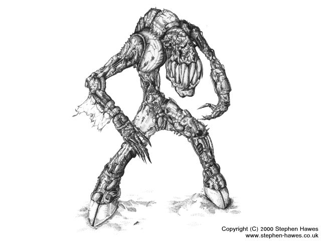
This is a black ink drawing (A3) from scratch, no ref etc.
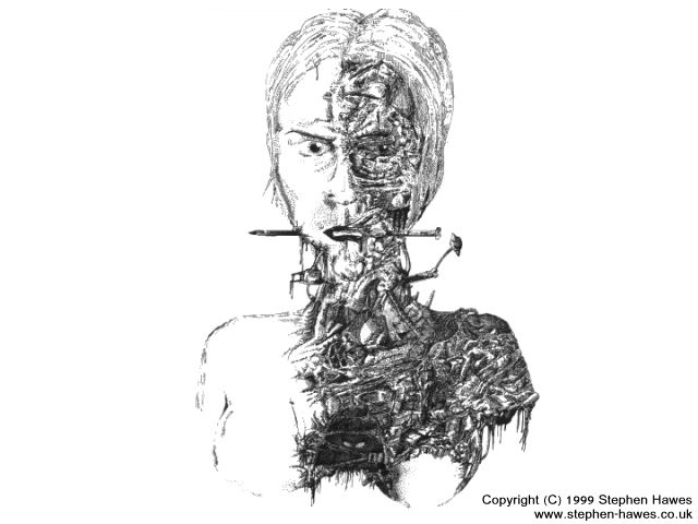
Another A3 Ink illustration.
Oh, and yeah I know of Vampire
Btw Fantasy Edge I think you work has really come on nicely
Ever thought of doing another style in addition?
www.stephen-hawes.co.uk
Actually, can kinda relax on the insane output since I got a Job as an artist now
Thanks for all the comments guys, much appreciated
Here''s another couple of 2D only
(lots of 3D material on website as well)

This is a black ink drawing (A3) from scratch, no ref etc.

Another A3 Ink illustration.
Oh, and yeah I know of Vampire
Btw Fantasy Edge I think you work has really come on nicely
Ever thought of doing another style in addition?
www.stephen-hawes.co.uk
mr hawes. we must really talk. you are an incredible artist. you might say you are my god. or at least one of them.


This topic is closed to new replies.
Advertisement
Popular Topics
Advertisement
Recommended Tutorials
Advertisement
