I've just released my first-ever game jam project called SudoKuu: a chance based, sequence matching, hyper-casual, gimmicky memory game. To commemorate this milestone, I've decided to write a postmortem about my journey: from the good to the bad. And share some insights on what I could've done better, what restrictions I faced and how I prioritized production.
Concepts
Initially, there were no concepts for this game. Heck, it was just an impulse of a decision, enforced by past and current events of my life; of which I'll talk about more later . . . Been around for a while, but actually never thought of doing a game jam of my own: wasn't fully ready, haven't had the required skills to do something under such a short period of time, and of course, haven't had the right tools for it (I'm calling you out Unreal!). Suffice to say that I'm still light-years away from coming up with something half decent. And I guess one could call me lucky that I was able to do this at all!
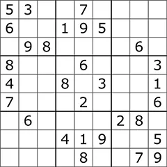
The initial thought for this jam came from my enjoyment of Sudoku. However, the game in its lonesome has been done trillions of times, and there are much better gaming solutions out there, than anything I could do in one week; even attempting this sounded madness. Then there was the issue with “it” not being fun enough. Don't get my wrong, playing Sudoku is a nice brain teaser game, but would fall flat, as my aim was to create something flashy, casual and fun. The biggest challenge, I suppose, was to convert the classic play (or at least the remnants of it) to something completely different; while withholding key aspects of the core mechanics. For better or worse, the outcome is a proof of itself that even a game like Sudoku, could be turned into something else; beyond its initial intention.
Design & goals
First steps & symbolism
This is where the idea of using monsters came to be (as of an IRL reminder). But, not in a sort of scary and daunting way. Instead, I wanted to turn things upside down, and make it more nonchalant, and cartoony. This was "equally" a design decision, and a budget restriction, as I knew that all resources would be made by me; and I'm not a good artist; just pretend to be one. Thus choosing this loose style fit the project perfectly.
The introduction of said monsters, evoked the idea of “What if the goal was to eat the numbers on the play-field.” From that I jumped to the memorizing a sequence idea, in order to clear the board/reach high scores, and technically came up with the core game loop: You get a level of difficulty, match a sequence, and start over. Simple, classic memory game style. At this point this wasn't on paper yet, but I knew that this idea could be done in a couple of days. Initially, I gave myself 3-4 days, because soon I realized that I had to make some compromises, as that was just simply impossible for me; plus there were several technical difficulties/challenges I didn't anticipate (more of that later).
Also, wanted to keep in mind that the project had to be kept simple, and made sure that it didn't get out of hand. It sort of did in a way; despite my best efforts. Haha! This also called for the notion of constant evolving, and one design decision in the morning, could've been easily changed in the afternoon, to better fit the overall picture.
Symbolism
The gameplay and the game mechanics are almost 1:1 representations of life. Think of it as an interpretation of what it means to achieve your goals, when (my) life is riddled with obstacles, and does everything in its power to stop me. That, combined with other experiences (and failures) provoked the idea of making it difficult to complete your memory sequence. Would note that the original idea was to leave in the “mechanic" of not being able to click through any of your distractions during gameplay, but that would've made it almost impossible to play. Thus the decision was made to make it more enjoyable, and not to push the game to unwanted territories.
Jumping in - Day 1 & 2
One of the first things I did, was to come up with the style I wished to use in the game: to compensate for the custom aspect of the project. I quickly settled on using brush strokes for this project, to further emphasize the nonchalant aspect, and to tie in with the Asian theme, Sudoku has in general (origins of the game). Furthermore, to convey the Japanese theme, I looked into the naming of the game itself. There's a good reason why SudoKuu is spelled the way it is! Kuu means to eat in Japanese. Sort of a pun and actual fact about the game (where you eat the cells of the Sudoku field). The idea of eating the game, literally, was just a frog's leap away. The result was this logo:

Simultaneously, I started to work on the code/game. First I had to initialize the project in Unreal (setting up all the requirements for a new project, with custom dependencies and blueprints), then laid out the basics: Setting up the player character (at this point I wasn't sure I'd use 3D objects or not; using pure widgets came later), which I didn't use at all in the end, establishing the ground for player controls and game modes.
This early in the game, I had no (set-in-stone) idea on how to draw the play-field: Thought of using the technique of talking cells, where each-and-every would listen to its neighbor, to determine their own value (as Sudoku has 81 cells, with row and column restrictions of 1-9). At this point, I thought of using all sorts of traces and whatnot (from my other projects, such as EOTH), because I was afraid of using 1D arrays. OK, I was terrified. With good reason of course. First, Sudoku uses a grid system, set in a 2D matrix, so having no options for that in Unreal (in blueprint mode; BP for short), meant that I had to deal with one long array, containing all row and column information; this was a big “oof” moment for me. Even questioned if the project could be executed as well. And second of all, Unreal doesn't like large 1D, BPs. Wrote a long blog post about it, at that is the only thing (up this day) that prevented me to further expand my pathfinding routine. The latter one can only be done via C++, so I'm glad that I could a half-descent job! Knowing all this, I was terrified, on second thought that the game would lag to bits, if confronted with yet again, large banks of arrays. Luckily, it all turned out fine, as in this case, the length of the table is only 81 characters, and problems only arise when you exceed a couple of hundreds (again, when you use pathfinding with cells, its unavoidable); which wasn't the case. But this deterred me to work on the game code for days, and instead I started to work on the menu system.
Originally I used a stock font, to cut down production, but towards the end of the jam, I changed my mind (among others), and decided to make my own; using FontForge.

Furthermore, the plan was to use SVG (vector) files, for making it the least demanding, and most scalable graphics. Unfortunately, Unreal doesn't support handling SVG files natively; only by using third party tools (which I couldn't afford at the time). Luckily, a random person on the web shared the idea of using fonts instead (for UI purposes); hence creating my own font came into play. A word of caution on this: Unless you're using it off screen, you'll be all right, however Unreal deletes every font object out of screen space. This was a lesson I had to learn, just when I packed the game for shipping; and was forced to convert all assets into PNGs (which broke the code as well). “Minor” inconvenience.
So the first two days were spent on figuring out the layout for the menu system, doing the coding behind it, making sure that the scenes are transitioning perfectly, variables are getting used at the right time and so forth. I forgot when I did this, but setting the scenes right was also important, as I was planning to add music (with adjustable levels) to the game. Despite my current knowledge of Unreal, making sure that all interfaces communicated right with each menu point (widget class in this case), was more challenging then I thought: not because I haven't done it before, in fact I know more of this then ever (like spawning an object, and only referencing it, without casting to it, or similar), although there's still a lot to go and discover, but because I still lack the knowledge to handle such rapid and extensive calls. Meaning that I still have the slightest idea, apart from making a debug interface (where I print all the necessary variables), on how to oversee and know where the code is at the moment (what functions are called, what variables are used, what state the games is, etc.). This made it impossible to implement features such as “Continue” the game (with a greater difficulty), as the moment I tried to implement it, I broke the game; again for the reasons that I couldn't oversee all the dependencies. Several features were cut solely because of this; sadly. And this fact alone made bug-tracking an ongoing challenge, where I couldn't even easily access to see the contents of my 1D arrays (that would fit on the screen). Something that must be discovered, as it's driving me nuts (alongside not having the slightest clue of when or how an infinite loop occurs). But now I'm just ranting about the engine, instead of talking about the project!
Coming back to using SVGs, a minimalist design philosophy was used to create the long list of assets: One by one, each text was exported, re-imported as text, then implemented into the game. Difficulty arose, when I started to use widget component “scale box”, which dynamically changes the size of the content, based on the screen resolution. It severely limits the customization of a widget, due to its nature, and cannot be applied to objects outside of screen space (such as the monsters and arms). Hence, other crude measures had to be implemented in the BP itself: made a simple if resolution is below the specs I used, then scale down, if larger then scale up the content by a given factor.
Remembering back, the first two days were more chaotic then any of the rest (like coming up with the Foley, which I recorded late in the jam), in terms of what to do and how to do it (as there was no set design to begin with). A lot of experimentation and back-and-forth had to happen, before anything useful saw daylight. Luckily, I had months of experience prior, so iterating didn't eat up as much time as I thought, and was making good progress (like adding foliage to the background, of fixing the transitioning between menu items).
Customization frenzy aka. styling
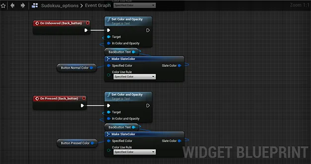
Then there was the issue of fiddling with the details. Making it a lean and custom game went out the gate, as soon as styling came into play. By default, there's way more customization in Unreal then my project needed, but either I discarded those or went on with the flow and not having to make workarounds. Chose the latter. But this gave the project and added (somewhat unnecessary) complexity, in term of making sure that the buttons, for example, had all the same styling in all states (with correct texture on top, with its own separate styling). This is fine, but when you need to access these attributes (aka. create bindings), things can get out of hand. See this example below, where you have to bind each button action uniquely (now imagine doing this over 81 buttons! Haha. More of that later.).
No gameplay in sight - Day (3) & 4
Unfortunately, don't remember much of day 3, as I had some obligations on my own, and had even less time to work on the project, but if I call correctly, day 3 and 4 consisted mostly of figuring out how to place objects outside of screen space, and animate them accordingly. The monsters and claws that are present in the level were made during this phase. Ironically, instead of focusing on the game itself (figuring out how to create the table). But I brushed off this looming feeling, as I convinced myself that these intrusions will be a crucial part of the design (gameplay), and it was worth the effort; which it did, but still I had my doubts.
I remember that clipping, and positioning were big issues, and took a lot of tries to make it look good (factoring multiple screen resolutions as much as I could).
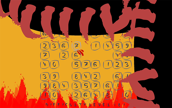
Then there was the problem of rendering all this on screen (ZOrder), as by default one has to set the visibility and user "responsiveness" (lack of a better word) that determines how the player interacts with the UI. This turned out to be a blessing in disguise, as I effectively started to use this as means of "disabling" mouse inputs (as for some reason disabling keyboard and mouse didn't work by itself), to stop UI elements from listening.
Timing also started to play an increasing role in the project, as I began to implement heavily randomized events (such as the timer, which is using a game tick independent method; via the “Set timer by event” node, for the curious one). To have a better overlook, check out the nodes for the monsters:
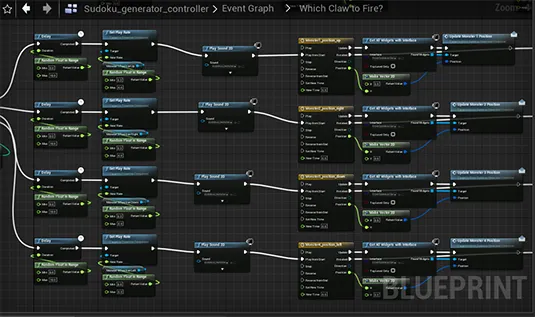
A great amount of care went into making sure that the parameters I set for these objects, were freely adjustable (and as such randomized). Heavy use of timelines, and curve were in place; latter one to define position and rotation on screen as these were streamlined to the corresponding UI (widget) element on a need-to-know basis.
Better organization of code played a huge role (for performance and ease of access), as I started to use functions exclusively, and abolished some ill practices I had before for addressing blueprint communications. Furthermore, think this was the time, or was around this or the next day that I decided to create that gobble animation (that eats the screen), to create a transition between menu and game.
Again, there were numerous design changes as well whilst working on the above: like changing how you adjusted the level difficulty (from spin box to slider; which is btw missing a cursor texture when dragged, forgot to do that). Which meant that all UI elements had to be revisited (like when I added that faint color change animation to the logo). Which reminds me that how cool is to just animate a color change in the design view (inside Unreal), and not have to deal with separate color nodes and all that jazz (just requires a play node and that's it).
O boy - Day 4 & 5+ish
The time has come to code Sudoku. A full day was spent on figuring out how to bind that 1D array to my licking. For one, the game had to know that there were rows and columns, and also had to be aware of the rules of the game (the 1-9 rule in each direction).
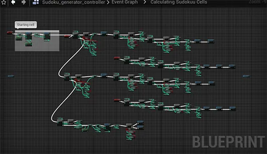
Won't bore you with the details but here's the gist: One number is selected, then the logic checks +-1 row&cell, then collects the data of previous cells, analyzes it and gives and educated guess on what to place in that x+1 cell (selected earlier). A lot of headache went into this, so much in fact that by the and of day 4, I had something that resembled a Sudoku, but was far away from it. Also, as I allured previously, it was really difficult to actually debug this code as I simply could not access (my screen is only 1680x1050) the main Sudoku table (consisting of 81 entries), so I spent most of my time going through the code bit-by-bit, hoping to find a culprit. With more or less success. Not gonna lie, I was worried when I went to bed that day!
O and forgot to mention that I also started to bound, prematurely, all cells to a table in the UI, for having an easy (visible) access to my array.
Another has come, and failures started to pile. The code just didn't want to cooperate. So I was faced with yet another difficult decision: Throw in the towel, or do the thing I didn't want to: start all over. And yes, that is exactly what I did. I started all over and rebuilt the code from scratch. Ouch. The reason why I wrote 5+ish, had to do with the fact that the next day I still had issues with the code; something that I couldn't fix since. O yeah, and the new code inherently provoked the God of Infinite Loop. Which pulled progress almost to a complete halt.
Moving on and cutting back - Day 6 & 7
Half of the next day was still QA: You can still see that for some reason the Sudoku logic cannot solve all 81 cells, and occasionally you'll see zeros in the table (ranging from 4-6ish I think). Was really sad about this one, as I wanted to create a perfect table, but it was time to move on, as there was no play-field, scoreboard, game logic for timing, listening to player inputs and calculating scores, etc . . . Time was of the essence; that's for sure. Just to give you an example of how crazy the implementation of the table was, let's have a look at how I handled the array for each cell (button):
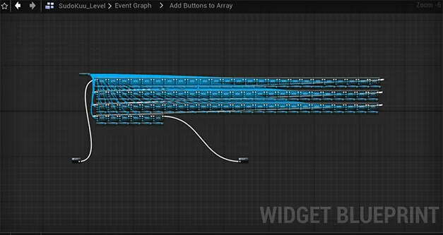
Each button, each text and animation had to be arranged into an array, so that the game logic could easily navigate through them. There was one caveat however: Button actions. For one reason or another, those cannot be accessed en masse. Which meant that each button had to be wired separately:
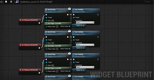
From a QA standpoint, this was a disaster, as there was a lot of room for (human) error; like how I missed a cell, and shifted everything over by one. But managed to climb this mountain as well, and began working on the rest. Occasionally having a quick look, if I could make a positive dent in the Sudoku code.
Originally, the idea was to add all kinds of special effects to the disappearing cells, by adding a lot of VFX and whatnot, but it all had to be scrapped as I was running out of time. Frequent crashes, and (usual) oddities also hindered my progress, and increased my levels of anxiety. By the end of the last day, it became clear that either I was extremely exhausted and could not see straight, or missed something crucial, but could not implement a simple "add + 1" to difficulty to continue. But for some reason my method of traversing back to the menu system worked perfectly. Again, no idea why, as there as no time to find that out. So at the last minute, that feature was scrapped as well, forcing you to go back and restart. Luckily its a fast process, as the game loads quickly.
All in all, by the end I was sort of happy with how it all turned out, even-though it had to be cut back by a lot. Then came the packaging and making the animation.
Note on packaging
Apart from the requirements for doing so, using only widgets proved to be more difficult than first thought: It missed all the text elements, which had to be redone, and adjusted in code accordingly, and didn't want to build correctly. Not sure if it had something to do with the fact that first I tried to package the project with visual studio 2017, or it's an inherited problem, but had to use wizardry, and heavy googling to get it to work (on top of getting VS2019).
Note on health
Have to mention that I've pushed harder than I should've, due to IRL exterior pressure, and shown signs of an unhealthy crunch: red eyes and high blood pressure. Didn't work 24/7, but I maximized my waking hours as much as I could (10-12h in some cases), compromising my health to some degree. Something, that hopefully will never happen again. Hopefully. Fingers crossed.
Final words
Hope you enjoyed my Ted talk and managed to gave you some insight on how this project came to be, from nothing, all to way to writing this blog post about it! If you're interested, you can check out the game itself at: https://theaaronstory.itch.io/sudokuu
And here's the promo video I did for this project:
Link in case broken: (https://youtu.be/Kf8Em9AatN0)

