Quick update on the lightning.
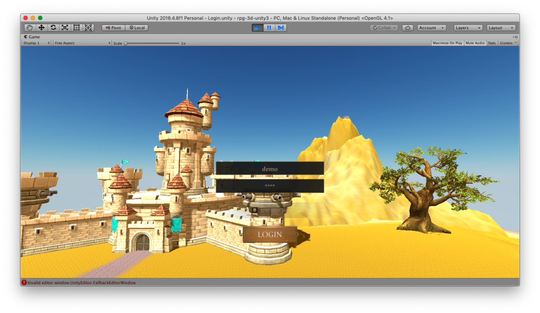
The initial login scren was quite a roughly slapped prototype, so I just gave it a little touch and also changed the camera to perspective. Just a quick touch and it looks better. It does still need a lot of work, but since I am not sure yet of the direction of what I want to present in the login, besides what I do want players to feel, I am not going to dedicate so much time on it, not yet.
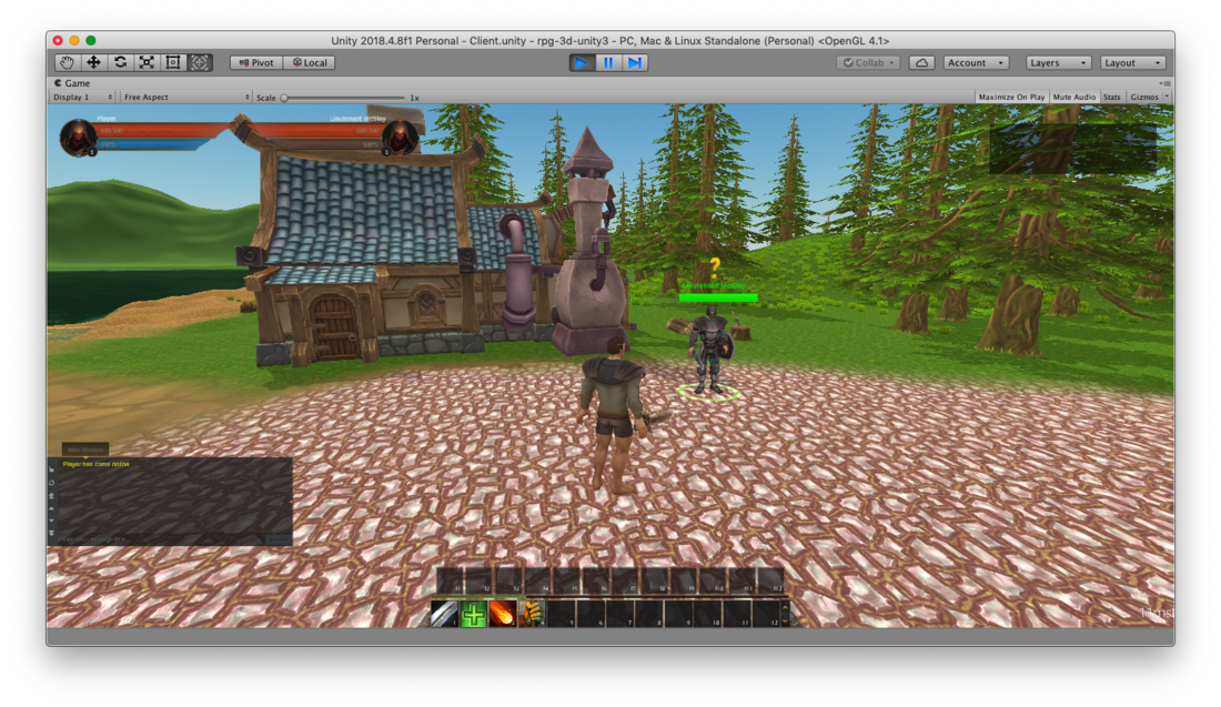
The other lighting adjustment I did was while playing. I set it to be brighter and it is better to go around and experience the game, and also better to show.
As usual, you can see videos of my project at https://www.youtube.com/channel/UCyOt8sPTqNxRseUzpzUEQQg

