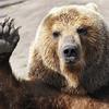
While some movement was best handled programmatically,
Feeding Time's extensive animal cast and layered environments still left plenty of room for hand-crafted animation. The animals in particular required experimentation to find an approach that could retain the hand-painted texturing of the illustrations while also harkening to hand-drawn animation.


An early pass involved creating actual sketched frames, then slicing the illustration into layers and carefully warping those into place to match each sketch. Once we decided to
limit all the animals to just a single angle, we dispensed with the sketch phase and settled on creating the posed illustrations directly. When the finalized dog image was ready, a full set of animations was created to test our planned lineup of animations.
The initial approach was to include Sleep, Happy, Idle, Sad, and Eat animations. Sleep would play at the start of the stage, then transition into Happy upon arrival of the delivery, then settle into Idle until the player attempted to eat food, resulting in Sad for incorrect choices and Eat for correct ones.


Ultimately, we decided to cut Sleep because its low visibility during the level intro didn't warrant the additional assets. We also discovered that having the animals rush onto the screen in the beginning of the level and dart away at the end helped to better delineate the gameplay phase.
There were also plans to play either Happy or Sad at end of each level for the animal that ate the most and the least food. The reactions to this, however, was almost overwhelmingly negative! Players hated the idea of always making one of the animals sad regardless of how many points they scored, so we quickly scrapped the idea.
The Happy and Sad animations were still retained to add a satisfying punch to a successful combo and to inform the player when an incorrect match was attempted. As we discovered, a sad puppy asking to be thrown a bone (instead of, say, a kitty's fish) proved to be a great deterrent for screen mashing and worked quite well as a passive tutorial.
While posing the frames one by one was effectively employed for the Dog, Cat, Mouse, and Rabbit, a more sophisticated and easily iterated upon approach was developed for the rest of the cast:


With both methods, hidden portions of the animal's faces such as teeth and tongues were painted beneath separated layers. In the improved method, however, these layers could be much more freely posed and keyframed with a variety of puppet and warp tools at our disposal to make modifications to posing or frame rate much simpler.


The poses themselves are often fairly extreme, but this was done to ensure that the motion was legible on small screens and at a fast pace in-game:

For Feeding Time's intro animation and environments, everything was illustrated in advance on its own layer, making animation prep a smoother process than separating the flattened animals had been.
The texture atlas comprising the numerous animal frames grew to quite a large size -- this is just a small chunk!

Because the background elements wouldn't require the hand-drawn motion of the animals, our proprietary tool "SLAM" was used to give artists the ability to create movement that would otherwise have to be input programmatically. With SLAM, much like Adobe Flash, artists can nest many layers of images and timelines, all of which loop within one master timeline.
SLAM's simple interface focuses on maximizing canvas visibility and allows animators to fine-tune image placement by numerical values if desired:

One advantage over Flash (and the initial reason SLAM was developed) is its capability to output final animation data in a succinct and clean format which maximizes our capability to port assets to other platforms.
Besides environments, SLAM also proved useful for large scale effects, which would otherwise bloat the game's filesize if rendered as image sequences:

Naturally, SLAM stands for
Slick
Ani
mation, which is what we set out to create with a compact number of image assets. Hopefully 'slick' is what you'll think when you see it in person, now that you have some insight into how we set things into motion!
Article Update Log
16 July 2014: Initial release

 An early pass involved creating actual sketched frames, then slicing the illustration into layers and carefully warping those into place to match each sketch. Once we decided to limit all the animals to just a single angle, we dispensed with the sketch phase and settled on creating the posed illustrations directly. When the finalized dog image was ready, a full set of animations was created to test our planned lineup of animations.
The initial approach was to include Sleep, Happy, Idle, Sad, and Eat animations. Sleep would play at the start of the stage, then transition into Happy upon arrival of the delivery, then settle into Idle until the player attempted to eat food, resulting in Sad for incorrect choices and Eat for correct ones.


 Ultimately, we decided to cut Sleep because its low visibility during the level intro didn't warrant the additional assets. We also discovered that having the animals rush onto the screen in the beginning of the level and dart away at the end helped to better delineate the gameplay phase.
There were also plans to play either Happy or Sad at end of each level for the animal that ate the most and the least food. The reactions to this, however, was almost overwhelmingly negative! Players hated the idea of always making one of the animals sad regardless of how many points they scored, so we quickly scrapped the idea.
The Happy and Sad animations were still retained to add a satisfying punch to a successful combo and to inform the player when an incorrect match was attempted. As we discovered, a sad puppy asking to be thrown a bone (instead of, say, a kitty's fish) proved to be a great deterrent for screen mashing and worked quite well as a passive tutorial.
While posing the frames one by one was effectively employed for the Dog, Cat, Mouse, and Rabbit, a more sophisticated and easily iterated upon approach was developed for the rest of the cast:


 With both methods, hidden portions of the animal's faces such as teeth and tongues were painted beneath separated layers. In the improved method, however, these layers could be much more freely posed and keyframed with a variety of puppet and warp tools at our disposal to make modifications to posing or frame rate much simpler.


 The poses themselves are often fairly extreme, but this was done to ensure that the motion was legible on small screens and at a fast pace in-game:
 For Feeding Time's intro animation and environments, everything was illustrated in advance on its own layer, making animation prep a smoother process than separating the flattened animals had been.
The texture atlas comprising the numerous animal frames grew to quite a large size -- this is just a small chunk!
 Because the background elements wouldn't require the hand-drawn motion of the animals, our proprietary tool "SLAM" was used to give artists the ability to create movement that would otherwise have to be input programmatically. With SLAM, much like Adobe Flash, artists can nest many layers of images and timelines, all of which loop within one master timeline.
SLAM's simple interface focuses on maximizing canvas visibility and allows animators to fine-tune image placement by numerical values if desired:
 One advantage over Flash (and the initial reason SLAM was developed) is its capability to output final animation data in a succinct and clean format which maximizes our capability to port assets to other platforms.
Besides environments, SLAM also proved useful for large scale effects, which would otherwise bloat the game's filesize if rendered as image sequences:
 Naturally, SLAM stands for Slick Animation, which is what we set out to create with a compact number of image assets. Hopefully 'slick' is what you'll think when you see it in person, now that you have some insight into how we set things into motion!


Great stuff thanks!
What program did you use to pull these emotions? is it self-made?