Does not look bad to me. Good sense of color composition.
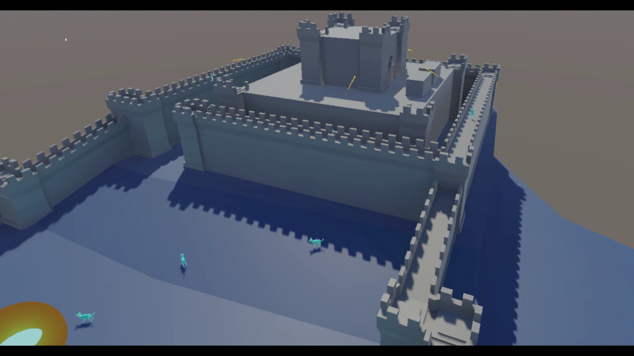
First image: The castle stone boxes on top of the walls (don't know the term) appear too regular and detailed in comparison. Look how the center building, using these features only sparsely, looks better than the surrounding walls which look more repetive and boring. Maybe use these stones only on towers but not walls, or use different scales of the stones to differentiate walls and towers.
In general, place some sparse detail here and there. E.g. some larger rocks and some bricks on the walls, some broken bricks fallen to the floor (but not collideable). This also helps with sense for navigation in gameplay.
But avoid large jumps in scale of detail. Imagine you would place a detailed statue before one of those flat shaded walls. This does not work. Even if the statue shares the untextured and flat shaded appearance of the wall, the difference in detail is too large we could mentally connect the statue and the wall. That's why things often appear ungrounded, or we feel too small in a level.
To fix this, place some larger rock(s) as well, nearby the statue. Then we have a connection of wall (low detail) → rock (medium detail) → statue (high detail). We also likely get some shadows to help even further.
It feels this is your biggest issue on the art side. Because of the third image, which totally falls appart. There i see very high detailed controller model with very high res texture. Then some unshaded abstract shapes, and zero detail in the background. Where am i? Is this a sky? Or a wall? It's hard to get any sense of depth and space here. Make some more floating islands (if i guess this right), and use a fog effect to help with depth, for example. And from the artistic view: Not sure if both a hand and controller model is necessary (no VR experience), but it would be good to replace the controller model with something that suits your other artstyle. Looks like you got free 3D model from SDK and they give that for free advertising, haha : ) (But no idea what's common here in VR - at least change / remove that texture)
Last image is fine. Obviously it lacks some detail too. But looks interesting to explore.
Beveling edges can be used not only to make edges round (which you might not want), but mainly to color or texture edge sections differently. I mean like Quake 3 levels where this has been used often. Ofc. such additional detail makes it harder to change geometry afterwards, so it's better to do it late than early.
Second image: I like that too. Maybe make some of the edges on the walls hard not soft, to get some detail without effort. And some more of those windows, some rocks.
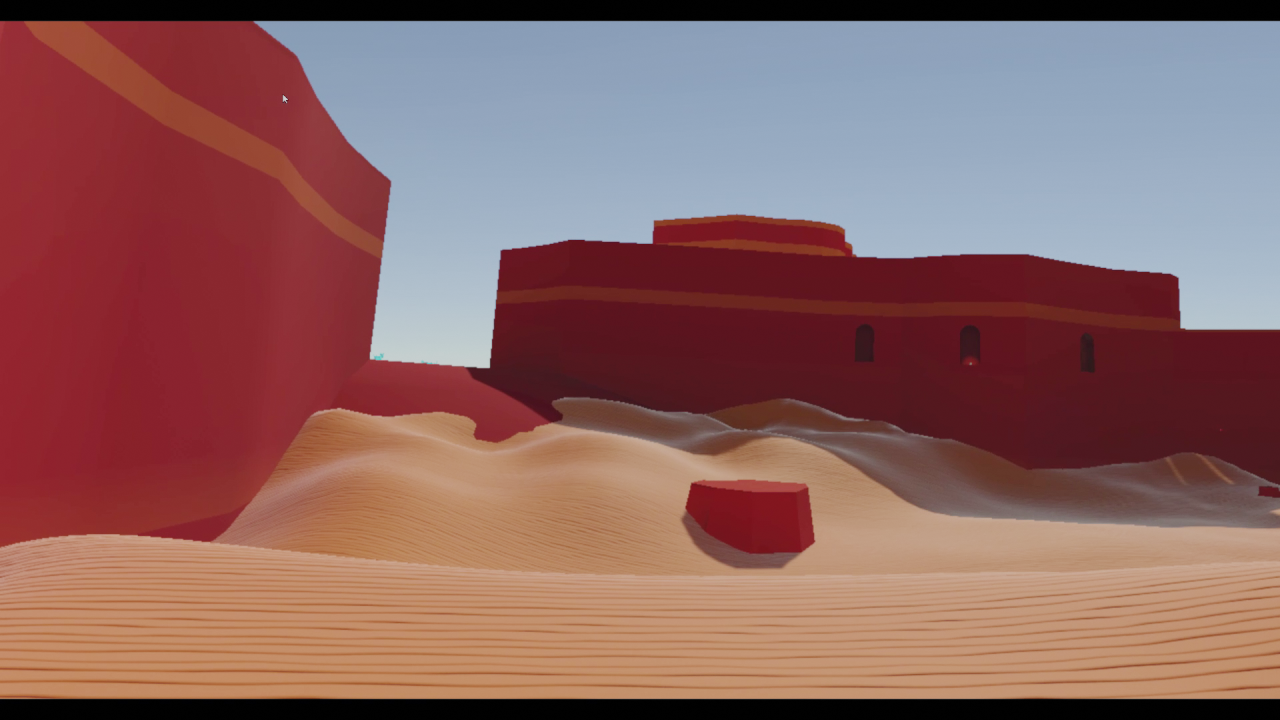
The fresnel on the sand looks bad. This reflections missing occlusion problem becomes even more visible with a low poly artstyle. And with such low detail you do not really benefit from PBR, so i would disable reflections on sand, eventually.
I assume in a VR game it helps to have detail everywhere, because with flat shaded walls the stereoscopic effect can't work and there is no additional sense for depth then? IDK how important this is, but it may force you to have textures. I like the sand texture because of it's low contrast. This way you give eyes enough ‘grip’, and you keep your color dominated low poly artstyle. That's subtle and good work, many would fail on this. Overall composition is good too. But yeah, you need to think about this scale thing when adding detail. You want more detail, but with variance in scale. Distribution of detail should not be uniform, otherwise it becomes just noise.