Hey, I have created a complete model with different rooms and floors. Now I want to create a mini map for this architecture model. It just that I don't know how these maps are created. I have tried to create by myself based on my assumption knowledge but it is not good. Below are link for which can give you guys general idea:
Below is the original map model which is render from top view:
https://ibb.co/4K7b2hf
Below is the map which I have tried to create by placing icons on the map:
https://ibb.co/vwyhRy7
How minimap are created in the games like GTA?
This is not a Game Design question (this was in the wrong forum). This question has been moved to a more appropriate forum.
-- Tom Sloper -- sloperama.com
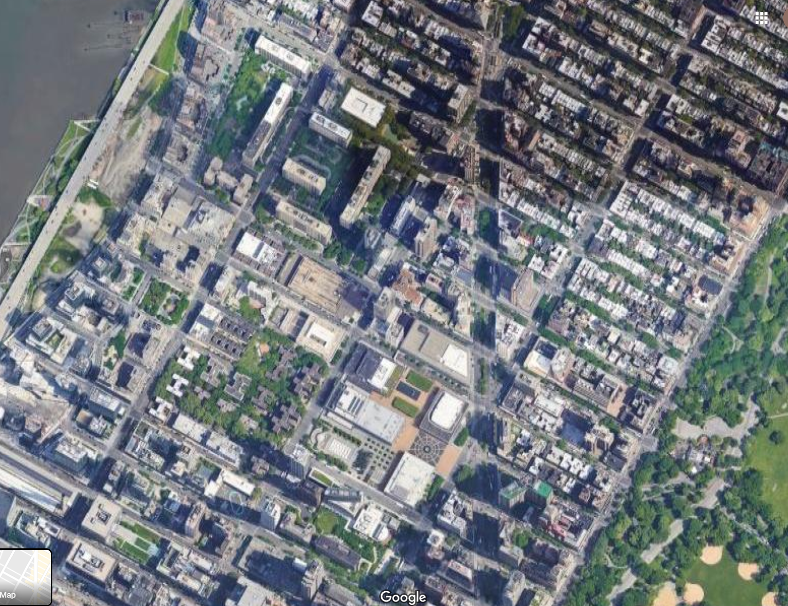
Look at this realistic satellite map from google maps:

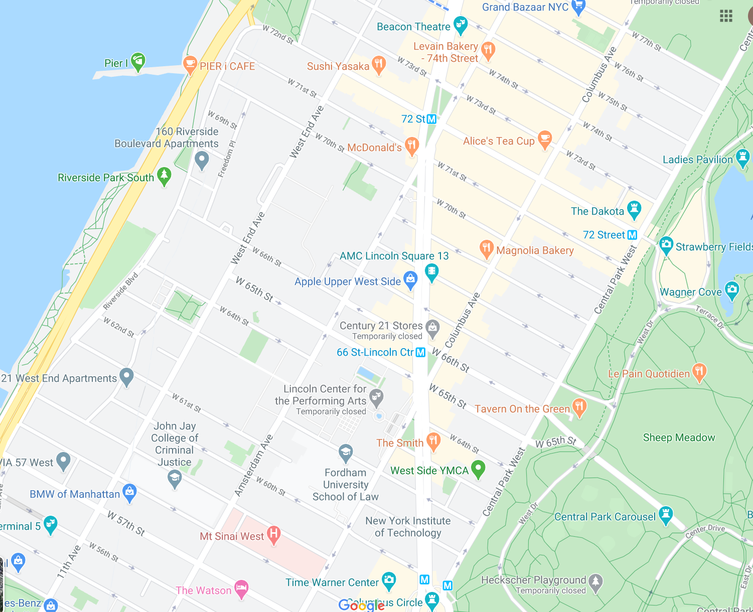
Now look at this map which has been mini-mapped by them:

You can equate this to minimap vs rendering. Rendering is meant to be real: Proportions are real , and it's very detailed (noisy) . Your eyes love noise (details). Without it things don't look real.
In contrast, the minimap is meant to be readable. There is no noise (the grass is solid green). They added borders to important features (ex: street blocks don't really have a dark grey border around them in real life. ). The proportions are wrong: If you zoom in/out to a certain degree, street widths will stay the same. There is no lighting or shadows either!
Doing some of this (proportiions) is really hard, and I don't suggest that you do it (at first).
Start with reducing noise on your map images:
- Remove the textures from everything
- Remove the shading (the green rectangles are shaded)
Then, if you have the patience, add borders to everything (this is moderate effort, skip it if steps 1 & 2 look like they are enough)
My Oculus Rift Game: RaiderV
My Android VR games: Time-Rider& Dozer Driver
My browser game: Vitrage - A game of stained glass
My android games : Enemies of the Crown & Killer Bees
How about using simpler textures (for instance solid colours) for your minimap lets say light yellow for walkable area's and black for walls. As an example I took your map and made a quick and dirty mock up:

None

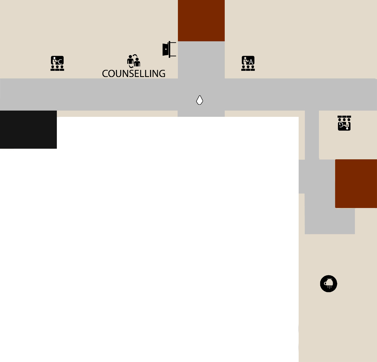
@SillyCow and @Switchboy Thanks for the response. I have followed your guidance and have made mini map in solid colours. Please share your suggestion about it.
I passed your minimap through an edge detect filter in GIMP.
Note: While you can do this in real time: a minimap's background does not tend to change in real time. So you can use a static image that you enhanced in Photoshop beforehand.

My Oculus Rift Game: RaiderV
My Android VR games: Time-Rider& Dozer Driver
My browser game: Vitrage - A game of stained glass
My android games : Enemies of the Crown & Killer Bees
@sillycow I don't get it. Does it be required to make the outline of the mini map ?
@Haziq no, you're minimap is already fine as is. I was just suggesting borders. There is not requirement for anything :-)
My Oculus Rift Game: RaiderV
My Android VR games: Time-Rider& Dozer Driver
My browser game: Vitrage - A game of stained glass
My android games : Enemies of the Crown & Killer Bees
@SillyCow Thanks mate this my first attempt to create any type of map. I am willing to improve it if you have any suggestion feel free to suggest. By the way this is ground floor of the building which I have created it not ideal and still need some improvement what do you think?


