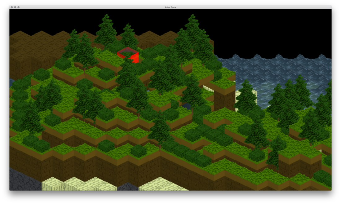
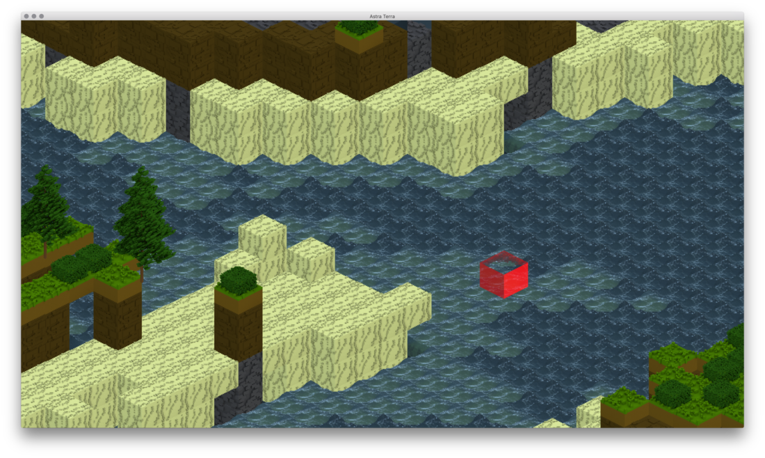
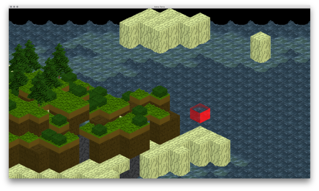
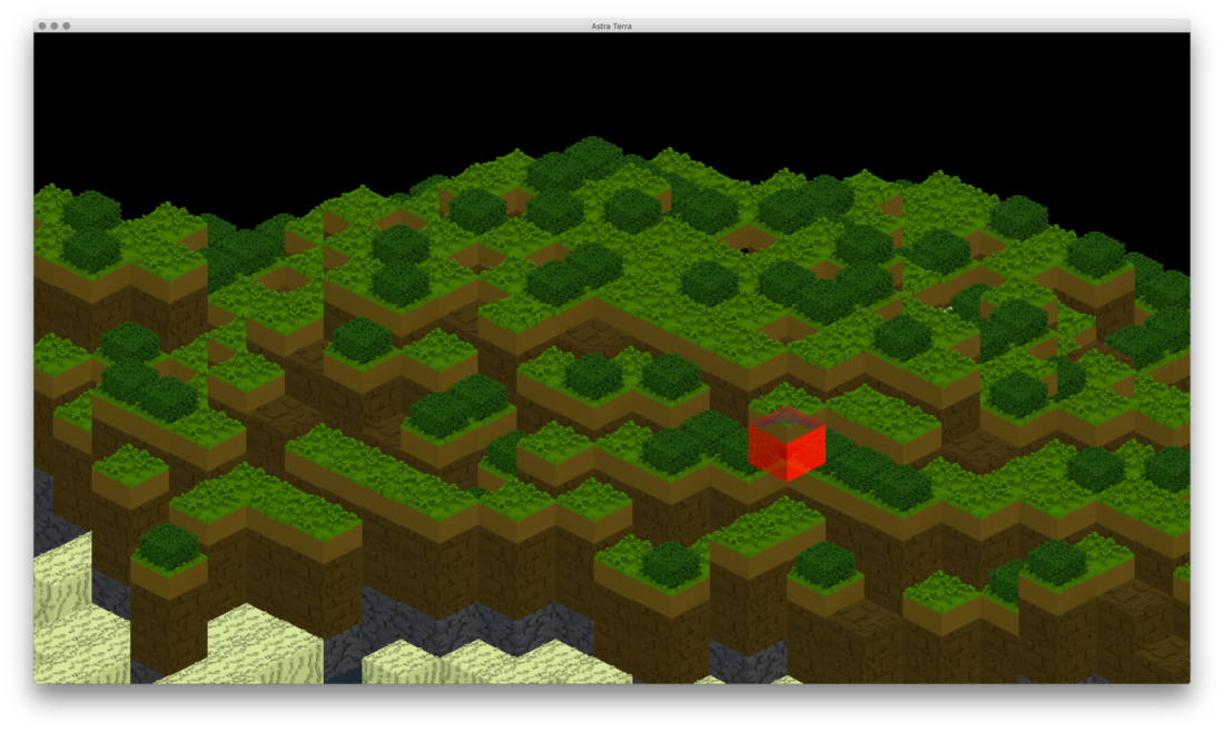
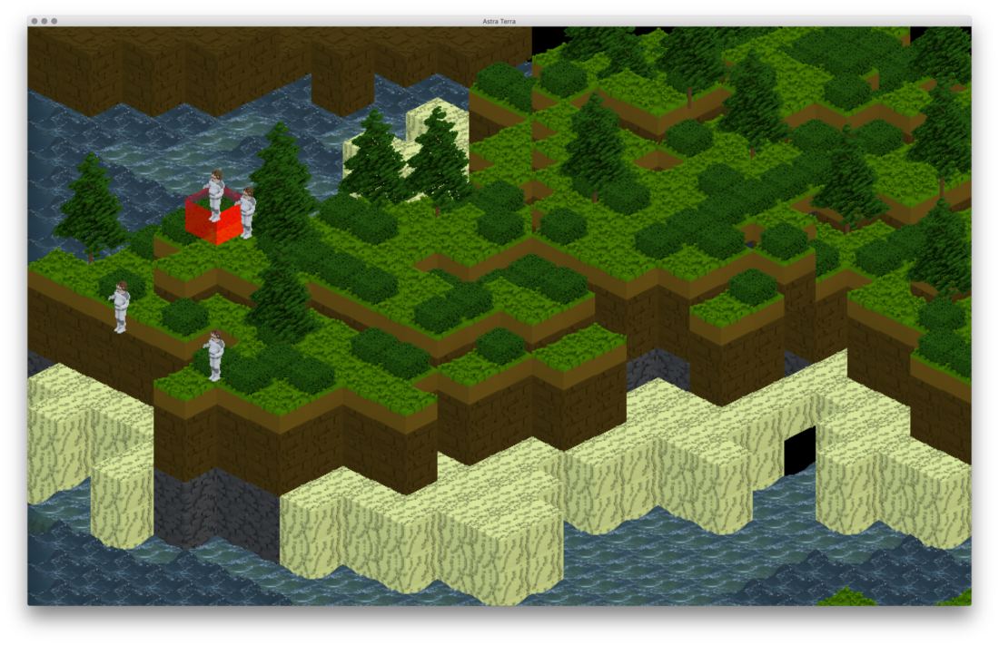
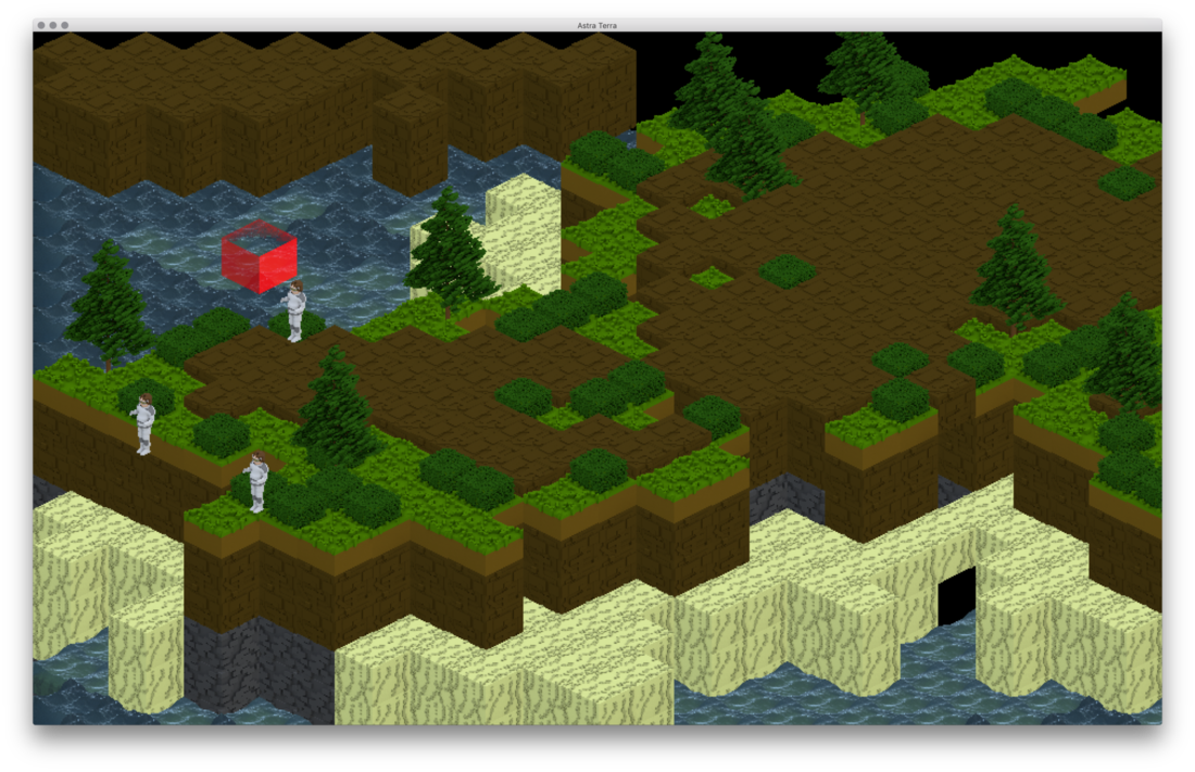
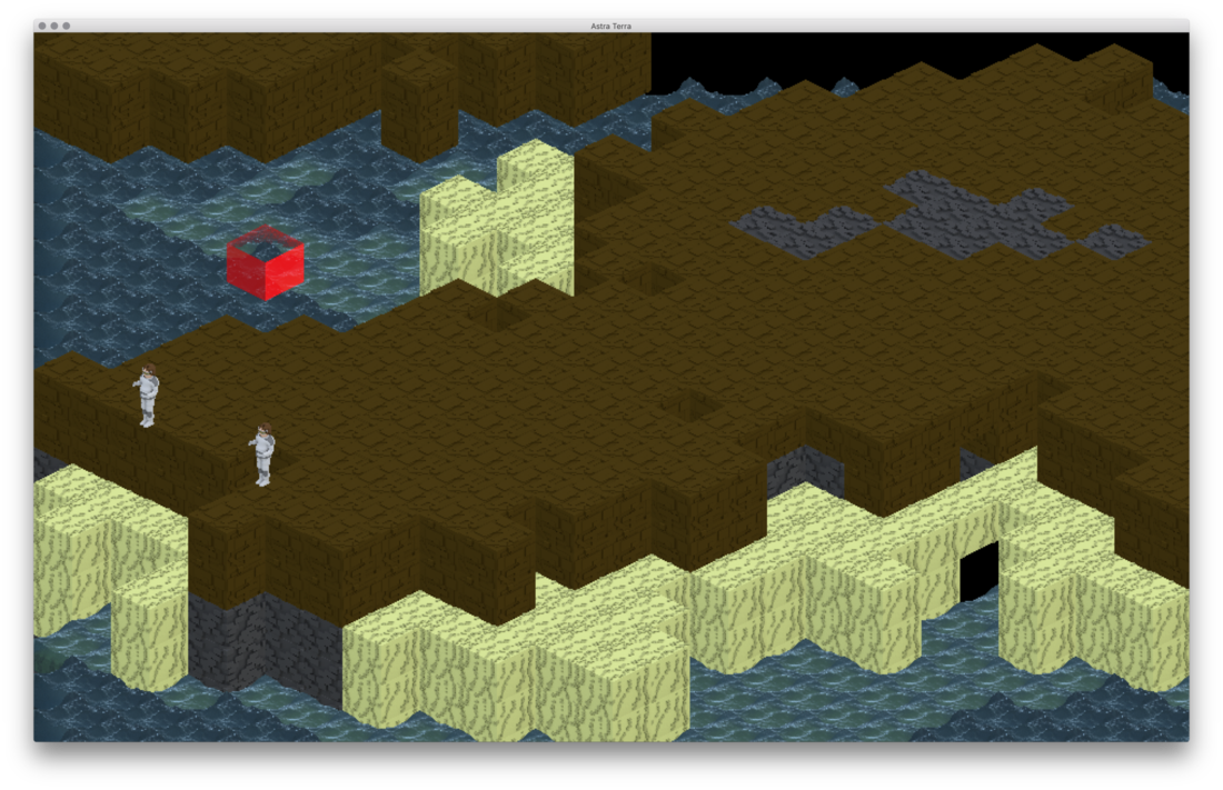
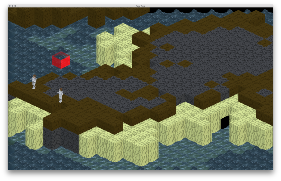
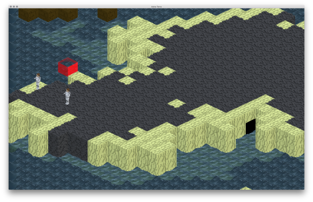
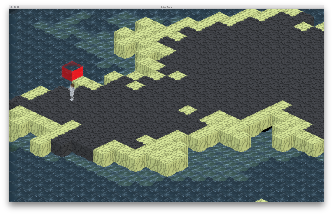
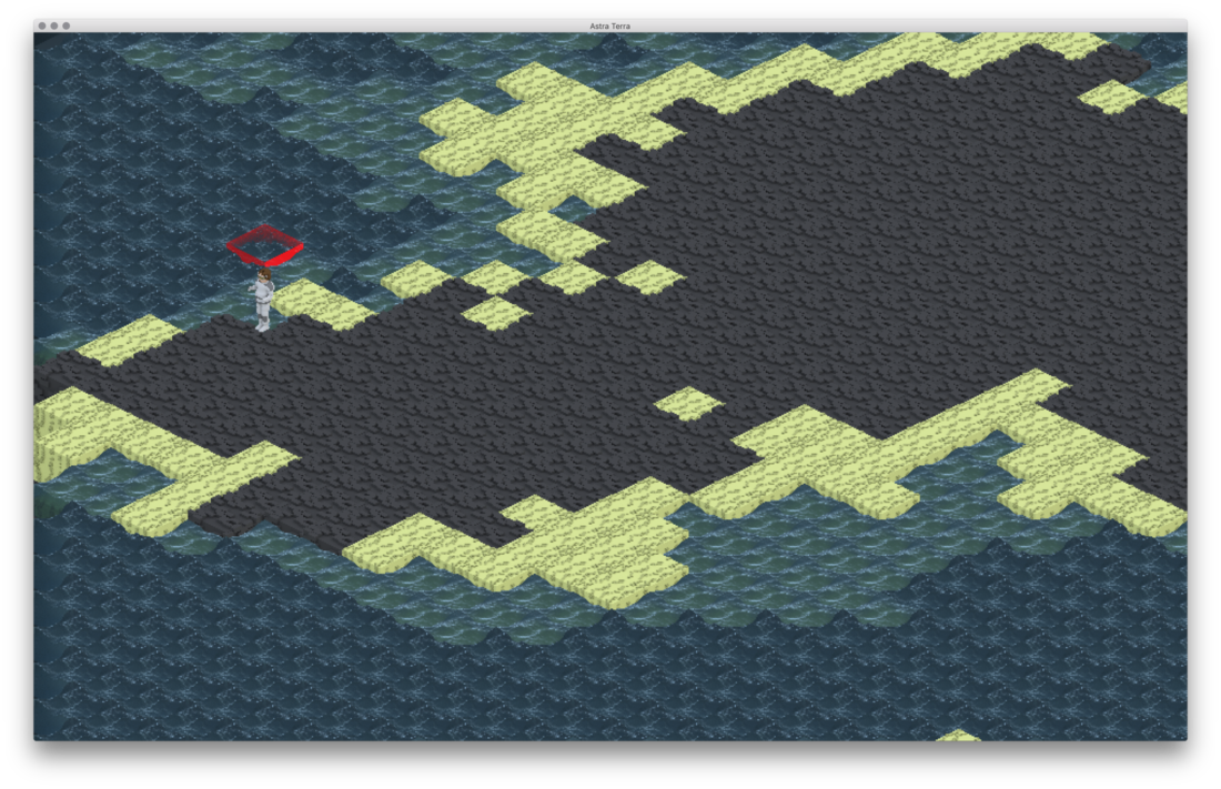
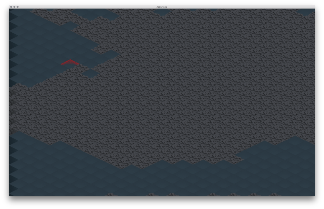
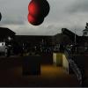
Hi everyone! This is my first post here. I'm an indie game developer with plans to release a game on Steam. The game I'm working on is a multiplayer real-time strategy game with base building elements modeled on RimWorld (tech tree and big base components, but also mining and building walls, etc), but also with a Z-axis involved. Currently, my game is about 67% of the way done, so I have the world generation, mining, stockpiling and movement done, and structures in place for the rest. It was originally going to be a 2D, orthogonal game with different levels shown a few at a time from above, like Dwarf Fortress, but the artist that I'm working with convinced me that using a more 3-dimensional view would be beneficial, both for ergonomics and understandability. We decided on using a staggered isometric view since that would be easier and more stylish than doing pure 3D, and prevent awkward camera issues. I've implemented the isometric view, using art that my artist 3D modeled and then exported as pixel art. I've attached some representative screenshots to this post.
The new isometric graphics are in early stages right now (its been five days exactly since I ripped out 2,400 lines of 2D draw code), so there's no UI to speak of and some optimizations (culling of underground tiles) may be acting up. Also, there are multiple biomes and unique grasses and flowers, dirt, stone, etc in the worldgen but my artist hasn't got around to doing those yet so we just have common-denominator art right now.
Also, the world generation algorithm is not set in stone. Right now, it uses several layers of simplex noise, plus adding random hills and then doing rain erosion simulations. After that, it adds biomes (which you can't see) based on height, temperature, proximity to water, etc. The height of the terrain is actually modified into a few flat planes by dividing the height output by the noise algorithm by four, then multiplying it by 2.5, and then casting to an integer (so throwing away the decimal). So, for instance, pillars of rock/dirt, and the fact that the beaches are kind of too high over the water are things we will eventually fix.
I'm pretty confident that the world generation is simple enough and the graphics clear enough to be understandable for modern strategy gamers but my artist has doubts. Do any of you have opinions on this? Also, if anyone has any suggestions as to how to make it clearer what level the user is looking at currently, or how to make Z-axis clearer, please let me know!
Thanks!

