Advertisement

Critique my portfolio

Started by May 13, 2017 04:46 PM
9 comments, last by zizulot 7 years, 1 month ago

Hey all,

I'm currently in my last year of uni, but after that I'm planning to become a freelance Game Artist/Illustrator. I was wondering if anyone could give me some feedback/thoughts on my portfolio just to get an outsiders perspective on what I'm missing/what I could improve on etc.

Personally I think my main focus should be on adding game assets on my portfolio.

My portfolio: https://www.artstation.com/artist/baukjespirit

My latest painting:

tree_guardian_by_baukjespirit-db8vcq7.pn

Your work is good, the only advice I have for you is to place your top 10 work pieces first, in larger icons than the others.

It's better to have a few well made pieces than to have a large page filled with different quality content.

The animation examples is not of the same quality as your still images, maybe have a separate page for your animations.

Advertisement

i agree with ninja - maybe even throw out like the worst 5 or something. i feel some of the work is clearly better and don't think you benefit from putting anything lesser besides it. also, but this is just taste, i think some of it is a bit too cheesy. i think i'd throw out wolf, glowing blue planet, griphon and maybe witch. but good lookin' stuff you made there, even if not my taste exactly - some sweet strokes in there.

More game assets, like you said. Also, once you get those assets, do some more sub-sectioning (Game assets, characters, landscapes, etc). You have good art, but it's a bit hard to build a consistent story in my mind, since the things that I'm interested in are scattered around.

Very good. It's beautiful. Personaly I would love it just a little bit more colorful.  :D

I think the foreground of the image is fantastic, strong vibrant colors and excellent lighting on the rider and griffin.  I can see the light striking the feathers and bleeding through to the arm.  However I find there to be a clash with the background and the foreground.  There is heavy shadowing on the underside of the griffin and heavy shadowing on top of the tree leaving a strip of brightly colored region in the lower half of the image which then darkens to an ambient light/shadow area.  Plainly it feels unbalanced.  

I think adding some more bounced light to the under (furry) body of the griffin will balance it a bit better as well as adding some lighter colors to the tops of the clouds it is flying through (thus facilitating the bouncing light more).  I'd probably add a bit of bounced light to the closest seagulls as well (VERY LITTLE).  My reasoning for this is considering the elf/rider has a considerable amount of light beaming down upon them from behind, presumably from the sun, I think there should be a bit more light bounding off the clouds the griffin is flying through, this is also supported by your rim light around the lower arms.


Advertisement
On 5/13/2017 at 11:46 AM, BaukjeSpirit said:

Personally I think my main focus should be on adding game assets on my portfolio.

This is really the only critique I have as well. Your profile looks great, and you are obviously a very talented artist!

I would definitely focus more on creating animations like your tiger jump. While static images/backgrounds make up a lot of game assets dynamic sprites are also very important. I worked with an artist who was a local freelancer and had previously never done animations before, and it took her some adjusting before she was able to make nice smooth animated sprites. The tiger looks good, so you're definitely on the right track. I would just try experimenting with more of that and general static game sprites as well. 

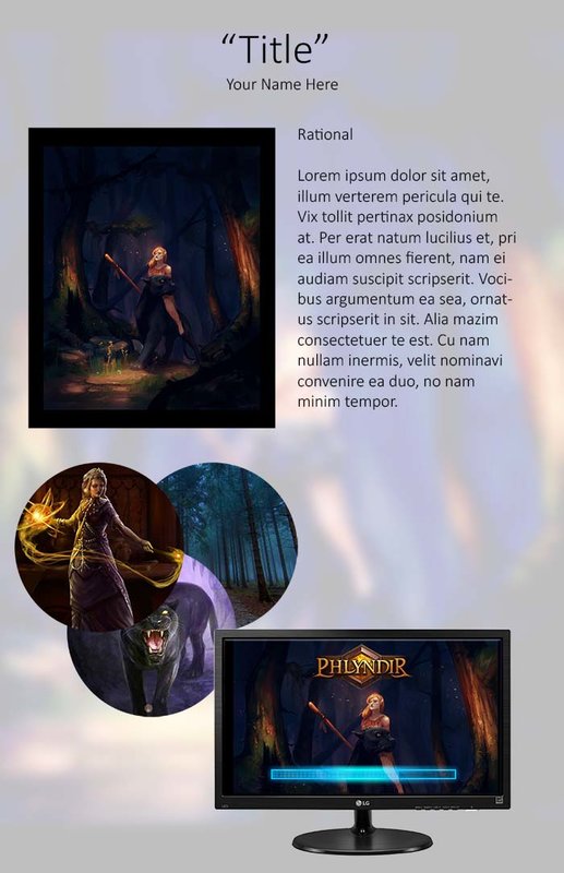
Great Art can not complain. What would help your portfolio is some Rationals. Talk about your inspirations, why you choose certain colours, talk about the elements. The shapes, the flow, the contrast. Add a story to your artwork. Even showing concept sketches. So make a Tabloid Size Document with the Finished Product, a example application (Loading Page) , some process images, and your Rational. As with a rocking title. If you ever print them out to bring to a company go hard stock. This will take the presentation of your portfolio much higher.

rational.jpg

Lolli xoxo

I like it. The colors and texture are good.

Awesome job you done :) , Im sure you will succed without problems.

This topic is closed to new replies.

Advertisement