Advertisement

RTS: which style would work best?

Started by December 26, 2016 09:32 AM
13 comments, last by Acharis 7 years, 10 months ago

(2D graphics/style question very linked to gameplay design so I put it here)

Im switching my rts from medieval to modern style, but still have two very different ideas/design decision to choose from:

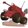
On the left: traditional RTS seen from above, rotating turrets and vehicles. Problem to make graphics for buildings and more work with units as well

On the right: abstracted icons for units and buildings. No rotation, units simply slide like in many turnbased war games.

Terrain is also harder to do in the left version, so likely i will go for a desert setting with little to no vegetation. The right version would have more abstracted terrain types such as "forest" and "hills", more like a map than actual terrain.

What is your input? Left version will probably be easier to make more action oriented, while right can be more tactical with different terrains and easier to add stuff like "fortify position" (just add icons for that since no need to animate).

However, right version feels much more stiff and lifeless as nothing can rotate...

(best would probably be to do all units in 3D and render 8 direction of it from an angled view, but no resources to do that)

1rgdO8Ci4.png

I find the less cheap variant (left) already too ugly for a RTS. I'm used to the isometric or 3D style of Warcraft II and Starcraft, and I consider proper animation, shadows and perspective necessary in a RTS.

If you only have resources to draw icons, choose a game design that looks good with icons.

The most obvious option is turn-based combat on a hex or square grid of map cells, like Advance Wars or (toning down the gorgeous graphics) Battle for Wesnoth.

Omae Wa Mou Shindeiru

Advertisement

Well it's a hobby project with just me in it, so have that in mind:) I made turnbased games already, wanna do realtime now:)

Im leaning towards the left version. It has a nice retro feel to it (dune 2!). And i guess i can pull it off eventually. More comment? I think icons in a RTS in this scale (not armies moving on a world map) is a bit too wierd for people.

Both versions are very good, I would play them! However, you are currently in the dilema many game developers face, you could spend more time on graphics and animation and less time on game development. Or you could spend less time on graphics and animation and more time on game development. I personally would prefer to play the game on the left, but code the game on the right haha, but in all honesty both ideas would work. For example, many good games have great graphics and animations but less of a story or world etc, and then on the other side is Dwarf Fortress which just has letters and symbols, but an insane world building engine and scenario creator etc. The choice is entirely up to you, but for ease of playing and attracting new players, I'd go for the one on the left with animations as it is also nicer to look at...

I'd favor left one between two options as well but is using 3D even with very basic geometry as prerendered assets really not an option? or pixel art?

mostates by moson?e | Embrace your burden

Nope no 3D for this project.

Advertisement

Both have their place. I think it's completely up to who your audience is (you) and what you want to make. When I look at the the pictures I prefer the left one and I think the right looks bland but I have played many a game that look like the right version and find them deeply engrossing. As you said, with the right one you can get away with things being abstract which means you can add features a lot faster and make it more a more complex game.

Look at Minecraft, if you wanna mine you just hit some blocks with a lumpy blocky thing and everyone is ok with it. If you want to mine in some AAA fps game.. different story and would probably be so impractical as to not be worth doing. Sometimes that simplicity is very freeing. Abstraction is great where you can use it.

If it was my decision I would be going with the left one. It looks more appealing, it adds things I am interested in and I think the cost of going that route is not too much and would be worth it. It also looks immediately more appealing to people too (in my opinion). Either way I don't think you can make a bad decision here, both options have pros and cons.

Interested in Fractals? Check out my App, Fractal Scout, free on the Google Play store.

Yeah im pursuing the left version right now. Thanks for your feedback!

Well, keep in mind IF you have access to a 3D engine, and some basic 3D modelling skills and/or access to simple 3D stock art, you could switch to a SIMPLE 3D art concept without spending too much time on it.

Yes, probably level design will take more time than tile based. Probably modelling the units takes more time even if you go with a simplistic style (save going with geometric forms only). But you will not have any troubles like drawing your units for multiple orientations or stuff like that. And with an RTS, you could foregoe any kind of animations which might cut down the time needed a lot.

Simply create chunky tanks with not too much detail as a polygon object, paint a rather coarse texture on it, render it small enough so that details are not really visible but big enough that the objects still look distinguishable from each other, and simply move/rotate/scale the unanimated objects in the engine to create the illusion of living things. Works pretty well for vehicles. Might work for very small infantry.

Add some simple particle effects for smoke and dust, or gunfire, and the player might not even notice that the tracks or wheels are not animated at all.

Of course, that is slightly OT... I like the left version better, looks more "coherent" for me. Really, even if the art for a single object in itself is crap, the total can still look convincing giving you are using a coherent art style. I get that from the left version (not saying anything looks crap ;) ), I miss that from the right. Trees, units and building don't mesh really, and I get the feeling they are not to scale. Left looks coherent and to scale.

Continuing:

(im using a strict 2d engine)

Any example of infantry done right in such a game? Im thinking each "unit" is up to five individuals, and there must be some individuallity when it comes to position and roations to look decent, but is that viable?

Game such as dune 2000 lets you train inf individually but you can fit 5 of them to each tile, might be messy to do for me though...

(easiest to just skip inf entierly, and might make sense in a near-future desert scenario (modern armies use mostly vehicles in open terrain), but dont want to give it up just yet).

This topic is closed to new replies.

Advertisement