what happened to good box art?
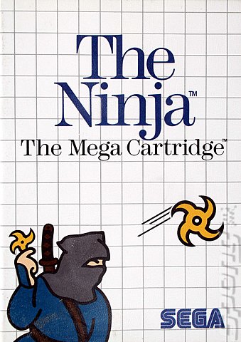
ever notice how the box art for pc games in the late 80s and early 90s was all awesome and handpainted and just gloriously huge. compare the art for a game like Silpheed from 1988 to a modern game. Why the hell does nobody make kick ass covers in huge boxes anymore?
Art goes through phases. I also miss the old painted movie posters.
ever notice how the box art for pc games in the late 80s and early 90s was all awesome and handpainted and just gloriously huge. compare the art for a game like Silpheed from 1988 to a modern game. Why the hell does nobody make kick ass covers in huge boxes anymore?
don't worry, in 10 years you can complain about why the box art of 2020 is worse than today's boxart(assuming we even still sell games in hardcopy forms by then.)
Check out https://www.facebook.com/LiquidGames for some great games made by me on the Playstation Mobile market.
I think it depends on the game. Even the same game can have versions that are great and terrible.


Do you have an example of some phenomenal mid-90s box art? I think there's a lot of solid box art these days in general.


Do you have an example of some phenomenal mid-90s box art? I think there's a lot of solid box art these days in general.
Wow!! I thought that the right box for the Batman Arkham City was a magazine cover. O.o
The level of awesomeness depends on the game. The tendency is: awesome game will have awesome art.
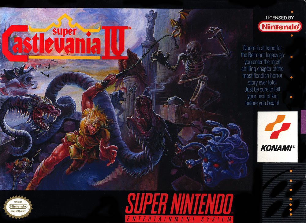
Awesome Castlevania from the 90s VERSUS Horrible Castlevania from the 2000s (good cover versus horrible cover)

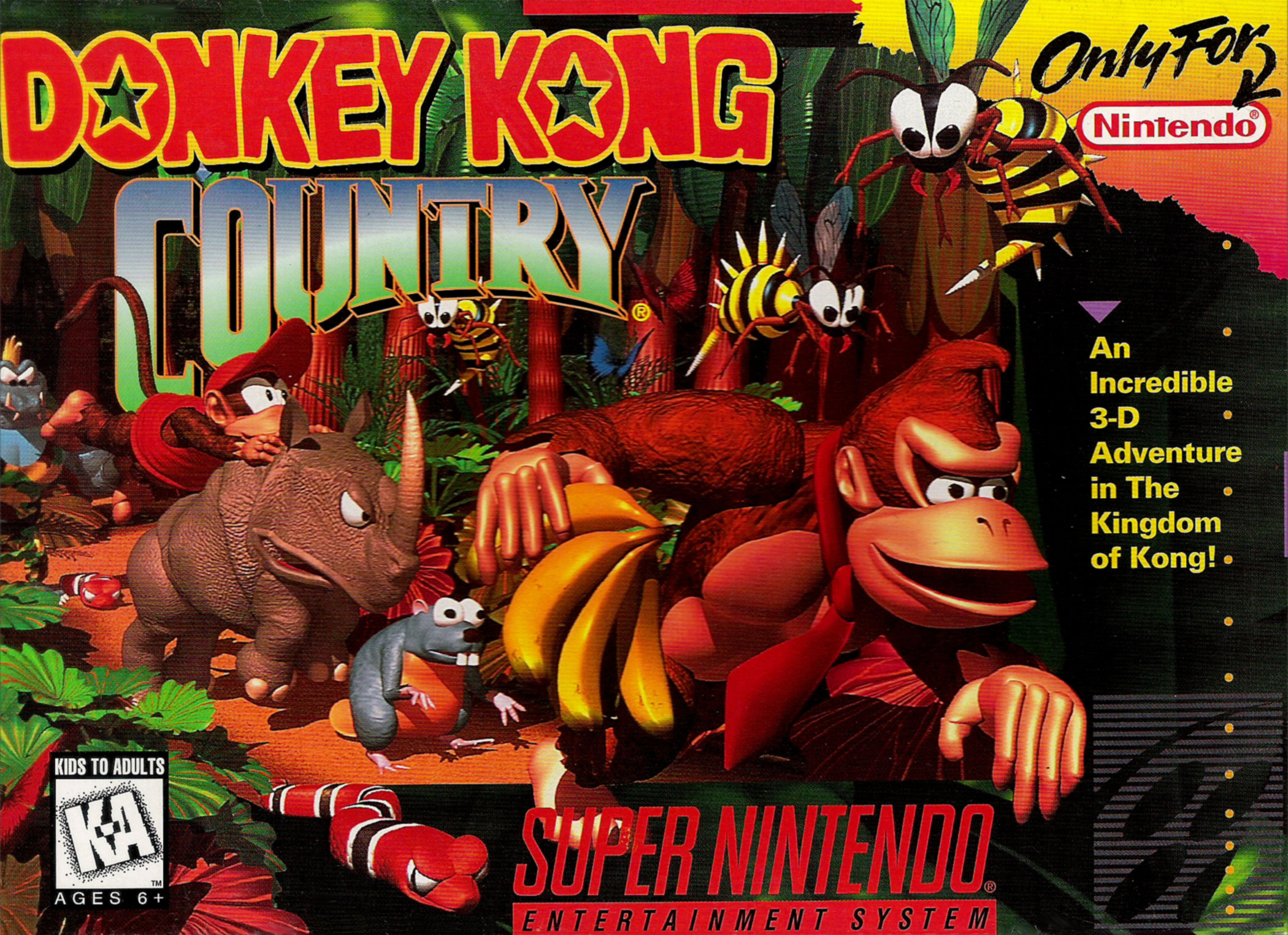
Awesome game from the 90s that still rules on the 2000s (Artwork is cool on both, but I prefer the one from Wii -- more cartoonish )

The level of awesomeness depends on the game. The tendency is: awesome game will have awesome art.
Awesome Castlevania from the 90s VERSUS Horrible Castlevania from the 2000s (good cover versus horrible cover)


Awesome game from the 90s that still rules on the 2000s (Artwork is cool on both, but I prefer the one from Wii -- more cartoonish )


Programming is an art. Game programming is a masterpiece!
Do you have an example of some phenomenal mid-90s box art? I think there's a lot of solid box art these days in general.
look no further

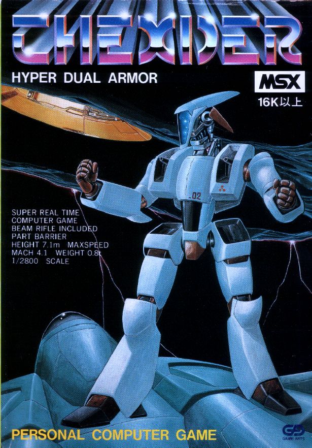


cut.
I won't argue that those aren't good, but I think it's rather typical nostalgia. The best of 20 years ago is better than the below average of today. I still don't think box art today is that terrible.
I won't argue that those aren't good, but I think it's rather typical nostalgia. The best of 20 years ago is better than the below average of today. I still don't think box art today is that terrible.
This.
I mean, some of those posted box covers just look cheesy to me. But then, I have some pretty strong memories of Legacy of the Wizard (man, the hours spent on that game) so sheer nostalgia alone makes me look at that cover and go "sweet!"
This topic is closed to new replies.
Advertisement
Popular Topics
Advertisement
Recommended Tutorials
Advertisement


