Hi,
I am trying to put together some new maps for my game and have a few questions and requests for advice, first here is some of the tiles laid out in my map editor:
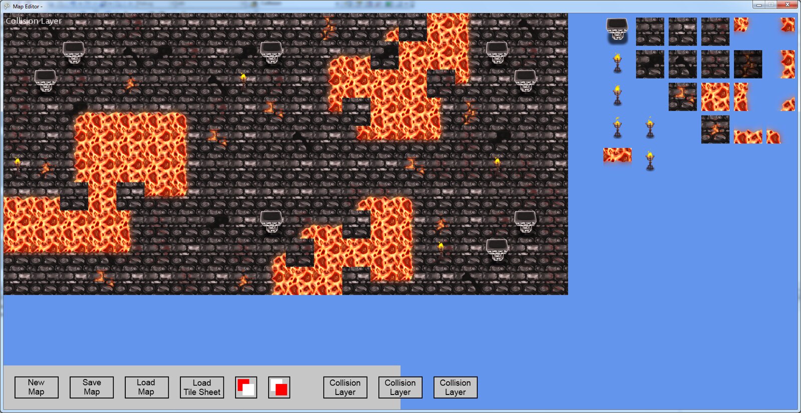
(there are a few tiles missing, like the 3 corner lava tile)
First my concerns:
1. The column tile does not look right against the floor. The tiles are each 64x64 and the characters are about the same size too in that looks weird while standing next to it. I think it looks out of place almost like a pickup item. i think i might try and make the top of the column a different angle so it looks more flat, making the far side much wider. Also i may try to make it 4x bigger to cover 4 tiles, maybe it will look more of a pillar then. Any suggestions? it seems hard to do on a top down view game.
2. I find it hard to think of objects to make the environment more exciting and believable. I am a programmer (contracting art out) so it is important that I come up with detailed lists of assets that I need, but I find it difficult to be creative with stuff like random items you would find in a dungeon, for example. Also it is important that it be the least amount of tiles possible to reduce cost. I realize random items will be extra tiles, but am looking for creative ideas maybe to mix and match things around the room to cut down on the tile count. Any suggestions would be greatly appreciated.
3. There are a few torches on the map which are hard to see, i have asked the artist to try and put a white outline on them so they are more visible, but i think it may look out of place being the only object with a white outline. Are there any other ways to contrast it from the floor better?
ideas:
4. I was thinking of adding a layer on top of all the game objects for ceiling objects, like dungeon style chandeliers, etc.. I think it will look odd if it moves around at the same rate as the floor does on screen scrolling, so I would have to add a scale to the movement so it looks like it is closer to the viewer. Do you think it would add to the environment? or do you think it would just be annoying to the player to have something in the way? I could also add transparency while the player is below the objects if that would help. good idea or nax?
Also, you might be able to tell on my excellent map layout design from above, but my map layout skills are terrible. If anyone is interested or talented in map layout/design i would be willing to throw some money into cool designs for levels, but that may be better placed in help wanted.
Any suggestions/criticism is appreciated, trying to work on my level design as i think it was a weak point in my original release of Undead Empire. The new changes dealing with environment will be environmental damage (lava) and map animations (like the torch).
Thanks guys,
Jake
Creating detailed environments with tiles, suggestions/advice
http://www.youtube.com/user/bigrookdigital
Undead Empire for Xbox 360 --> http://bit.ly/dYdu3z
Gamerscore Tracker for Xbox 360 --> http://bit.ly/vI4T4X
www.bigrookgames.com
twitter.com/BigRookGames
One thing to remember that is important not only with tiled backgrounds, but with game worlds in general, is that the most important part of the game is not the background, but the characters upon it. The player, the enemies, etc... The background is merely a backdrop. In light of that fact, it is best that the backdrop not overwhelm the foreground objects, be it by high-contrast or clashing colors, etc...The main problem I see with your tiles is that they are very noise, very high-contrast. Any object viewed against it is going to sort of disappear.
For the most part, you should use "cooler" colors for the background, "warmer" colors for the foreground objects. You should keep contrasts on the background relatively low. Keep the colors slightly desaturated in comparison to the foreground. Also, you want to avoid using the upper and lower ends of the value scale for very common usage, and reserve those extremes for highlights and details. By this, what I mean is that you shouldn't make your floor such a huge chunk of very dark black. Very dark black should be reserved for shadows and lighting, rather than actual coloration. Keep your tones more in the middle ranges of the value scale, and by contrast the shadows will be more emphasized. For example, your pillar sprite has a soft shadow, but when the sprite is placed against the very dark background, the shadow is almost completely unnoticable. Shading is VERY important for properly conveying shape and form, but against a black background the nuances of shadow are lost.
Another problem I see is that your stone floor simply doesn't look like stone. It looks more like shiny bits of metal floating in blackness. The pillars seem to be made of an entirely different material altogether. In reality, if you were making a dungeon or castle, you would use a lot of the same stone for the floor and the supports. The exception would be for things meant to be decorative, in which case you would choose a material meant to complement the base material: colorful white marble against gray stone, etc...
Now, your lava tiles can be warm and bright; if viewed alongside a more muted stone, it would make them "pop" more than they currently do. But the problem with the torches and lava is that their emitted light doesn't affect the scene at all. To see what I mean, take a look at this screenshot from Diablo 2:
You see how the light of the lava casts a reddish hue on the stone immediately adjacent to it? Some lighting highlights applied to the tiles around a lava pool in your tileset would help immensely. Similarly with your lights. Whether you accomplish this through actual lighting, or whether you accomplish it with specially lit tiles, the results would definitely be worth the effort.
A final criticism is that I find the viewing angle of the column to be jarring. The column is viewed at a slightly oblique angle, showing the front side, but the floor is strictly top down. Perhaps you could construct some tiles to show the sides of the pit the lava is in, to maintain consistency.
This topic is closed to new replies.
Advertisement
Popular Topics
Advertisement
Recommended Tutorials
Advertisement