Advertisement

Indoor level wall design? (classic 2d RPG style)

Started by July 24, 2009 03:05 AM
16 comments, last by Ravyne 15 years, 6 months ago
I'm trying to decide on what sort of style I want to use for indoor levels. The type of game I'm referring to is the classic 2D topdown/fixed angle rpgs and action games. Here are some examples: Only show walls at the top of the level, have an outer edge going around the entire room, indicating the top of the wall: 
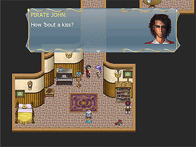
Same as above except the entry ways are cut in: No wall border, just pure black: A skewed perspective where all parts of the walls are seen at all angles. (legend of zelda style): If you know of any more please share. Also as an additional question, what sort of system do you think works best for collision/interaction with the walls? (particularly the bottom half of the wall) Should the player collide with the edge directly? Should the player pass under the edge (as to give the illusion of depth) The first option is used quite often, the second option seems more realistic but the problem lies in the fact that things are obscured from view. By doing this, should we then have it "fade" so that you can see through the upper edge of the wall? Here's an example of what I'm referring to:
[size="3"]Thrones Online - Tactical Turnbased RPG
Visit my website to check out the latest updates on my online game
Really it just comes down to preference because none of them have any true advantages over the other, just artistic decisions on the part of the artist. I personally most enjoy a "realistic" angle, such as your first example, with transparency for overhanging walls when the player (or important things) are underneath them. It's nice to have a place to hide secret doors and chests as well, as people will not always check those edges. I found the Zelda style of wall display mortifying, as I can't accept the perspective and find myself more focused on the fact that it's so terribly wrong then paying attention to the otherwise artful graphics (at least, for their time...).
Advertisement
I personally prefer the Zelda style. I don't think of obscuring walls as a way to hide secrets, I think of them as a way to frustrate the player by hiding things their character would be easily able to see. Zelda's style facilitates good gameplay, so it gets my vote.
You will have to code the second option anyway for when objects are in front of the characters, which should indeed mask part of the character.

Secret of Mana-style is definitely my favorite, albeit the Legend of Zelda-style makes the world more accessible by not hiding anything.

(Otherwise, you could just use 3D and let the user tune the camera ;))
Some good points. One thing I'd like to mention is the Zelda walls comment. Sure it lets you see "everything" but when have they really put the bottom portion of the walls to any use? Aside from being able to see what is right up against the edge of the wall that is. (which could be done with some semi-transparent trickery)

Another question I wanted to ask... Is there anything that could be done with all of that empty black space? Should it just remain empty and black or should it be tinted different colors depending on the room? Should there be some sort of texture going on there?

What about doing the "cutaway" style, where when you enter a building on the overworld, it doesn't transport you to another level, it merely darkens the outside and hides the outer part of the house, revealing the inner part. I can't think of a game that does this but I know I've played one.

That sort of style would require that buildings actually be scaled to size though, which tends to be a problem as the buildings will take up far more physical space on the overworld. Thoughts?
[size="3"]Thrones Online - Tactical Turnbased RPG
Visit my website to check out the latest updates on my online game
Zelda style for me. I hate nothing more than being unable to see something that my character naturally would be able to see. Screen edges will do this inevitably in outdoor areas, but indoors I should never wonder whether there's a window or a cabinet (or an enemy!) two feet in front of my guy.

Zelda seldom used that to any real advantage, since there was never anything interactive on the bottom or side walls (as I recall), but it's still the viewpoint I'd prefer.
Advertisement
I like the more realistic 45 degree orthographic perspective, the main thing is that just because you can hide important details behind a wall doesn't mean you have to and if the level designer wants to be an ass false perspectives aren't going to stop them.

If you do use it though I recommend blocking off most of the behind areas so you can never have more than 50% of your sprite obscured.
I have to agree with going with Zelda style. I've been playing Secret of Mana these past few nights for the first time and having monsters obscured by the art style is a major dislike of mine for this game. I have run into a few things and taken damage because of this, and realistically, since the monster and my character are on the same horizontal line, the monster would not be obscured. But it is, due to the perspective!

It's really a minor complaint though. In the end it's about the artwork, and as long as the placement of enemies is not relying on hiding them behind the artwork every time, then go with what looks cool. On the other hand, if every enemy is placed to be hidden in a place that they should be visible from if you were actually able to see the view from the player's eyes, then I would stop playing pretty quickly.
Zelda gives you more playability while still looking pretty. The other styles, especially the more hidden one would just frustrate the player and hinder the game flow.

Zelda gets my vote.

Saves you time, money, and gives your artist/you an easier time designing everything without having the frustrations of scaling / rescaling other buildings / coding transparency + having to create the artwork for it.

I would go with what's proven to be most successful in the examples you gave.
consider the way it is done in Mr Robot: (it was also done this way for the old Little Big Adventure)


In this method, the near wall is either obscured completely, or 'cut' so that you can see everything in the room, while still showing the outlines of doors and walls.
Geordi
George D. Filiotis

This topic is closed to new replies.

Advertisement