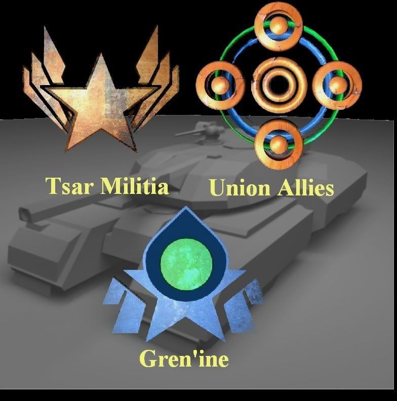
Faction symbols
Took a 2d outline of some symbols, modelled and textured. It's for a game I'm working on (Sci-Fi RTS).


NBA2K, Madden, Maneater, Killing Floor, Sims
I like 'em. The names even match their respective symbols, err, except for the Gren'ine, which I have nothing to go off of--is this an alien faction?
Visually, the symbols look a bit too rough around the edges; lot of aliasing, it looks like. The textures themselves also look a bit too gritty, though this may be by design--I think they'd look better if they were a bit smoother.
But yeah, they look good. Do you have any other artwork to go along with the symbols? Uniform concepts, perhaps, showing off the insignias?
As for aliasing, I rendered them, put them in GIMP and the wand tool took away some pixels :(. Yea, there are some concepts. All 3 factions human. The Gren'ine are the power hungry faction.
NBA2K, Madden, Maneater, Killing Floor, Sims
I like them as well. I would have guessed power hungry / empire from the Gren'ine symbol too. The stars in the two symbols makes me think the militia was formed by Gren'ine nationals. I don't know if that's the case, but either way it's great to see symbols which look like they mean something. Better than the generic wolf/jade falcon symbols from Mech Warrior.
I'd agree that at least the Allies/Gren'ine symbols are rough for a template symbol. They would fit as is on an actual war-hardened vehicle, but on a door or a flag or whatever, I think it'd look better as more solid shapes.
I'd agree that at least the Allies/Gren'ine symbols are rough for a template symbol. They would fit as is on an actual war-hardened vehicle, but on a door or a flag or whatever, I think it'd look better as more solid shapes.
Looks nice, though I think that allies' logo is too complex, try to make it simplier
Nice. [smile] I just finished doing a set of 12 of these as a freelance job. Mine were vector graphics as per the client's request.
I want to help design a "sandpark" MMO. Optional interactive story with quests and deeply characterized NPCs, plus sandbox elements like player-craftable housing and lots of other crafting. If you are starting a design of this type, please PM me. I also love pet-breeding games.
As others have noted, the symbols are elegant and appropriate but they have a lot of minute details and the mentioned "gritty" textures; I'm afraid that in practical sizes (icons, unit decals, flags and banners, etc.) they'll be confused and dirty.
I think you should draw small versions and monochromatic variants of the logos to validate your design and discover if some simplification is needed.
For example, the Tsar Militia can have straight vertical lances rather than the current perspective of blades with a complex shape; the rings of the Union Allies can have a regular radius and spacing; the Gren'Ine can lose all the rather arbitrary ligkt blue part and add something meaningful and consistent to the dark blue core.
Another issue is that all three symbols are too complex to be hand drawn: they won't realistically appear in wall graffiti, in letters, written in blood by a dying patriot, etc.
Omae Wa Mou Shindeiru
This topic is closed to new replies.
Advertisement
Popular Topics
Advertisement
Recommended Tutorials
Advertisement
