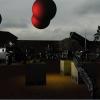
 But Its not really up to par, I want a kind of cartoonish feel, the characters and stuff in my game all have cel-shaded appearence, the tree is too, althought its hard to tell. But I also want to have some realistic kinda feel, but Im not all that great with this kind of things, so I was wondering if I could get some feed back on how I could improve this.
just thought I would mention the total Geometry:
Tree model
586 Vertices
1168 Faces
Leafs
2288 Vertices
1144 Faces
Tree, How can I improve this?
Hi, This is more Artisitic then anything so I thought I would post it here
I have been working on trees for my game. I made the model, and to do the leafs I wrote an algorithm to create them based on vertices and normals and such. my results are ok,
 But Its not really up to par, I want a kind of cartoonish feel, the characters and stuff in my game all have cel-shaded appearence, the tree is too, althought its hard to tell. But I also want to have some realistic kinda feel, but Im not all that great with this kind of things, so I was wondering if I could get some feed back on how I could improve this.
just thought I would mention the total Geometry:
Tree model
586 Vertices
1168 Faces
Leafs
2288 Vertices
1144 Faces
"I seek knowledge and to help those who also seek it"
It certainly needs better lighting. Also, right now, the leaves look like photographs of leaves glued on. Maybe work on the texture and give the leaves a tiny little bit of depth.
-~-The Cow of Darkness-~-
Thanks for the fast responce,
any idea for the best way to achive this? as I mentioned im not really that great with art, I was thinking of lighting the leafs, I haven't done any lighting on them yet because im not sure the best way to achive it. I was thinking of shadowing them based on the number of leafs that were between them and the sun, beacause useing normal lighting on the leafs wouldn't work that well. What do you think of this?
Quote:
give the leaves a tiny little bit of depth.
any idea for the best way to achive this? as I mentioned im not really that great with art, I was thinking of lighting the leafs, I haven't done any lighting on them yet because im not sure the best way to achive it. I was thinking of shadowing them based on the number of leafs that were between them and the sun, beacause useing normal lighting on the leafs wouldn't work that well. What do you think of this?
"I seek knowledge and to help those who also seek it"
Real leaves are a little bit translucent - you can see sunlight glowng through them. You can put a blob of dark green or black in the middle of your tree to simulate depth and cover it up with layers of translucent leaves and then you'll get that nice look where the tree glows/is lighter colored at the edges and looks more solid in the middle. The texture for the bark is nice btw.
I want to help design a "sandpark" MMO. Optional interactive story with quests and deeply characterized NPCs, plus sandbox elements like player-craftable housing and lots of other crafting. If you are starting a design of this type, please PM me. I also love pet-breeding games.
One more thing... make the trees roots longer. It looks more realistic and can make the tree look really nice.
-~-The Cow of Darkness-~-
Quote: Original post by sunandshadow
Real leaves are a little bit translucent - you can see sunlight glowng through them. You can put a blob of dark green or black in the middle of your tree to simulate depth and cover it up with layers of translucent leaves and then you'll get that nice look where the tree glows/is lighter colored at the edges and looks more solid in the middle. The texture for the bark is nice btw.
Hmm, I dont know if I can achive that, I can't really use transceparency for the leafs in the game. would cause to many issues. and I can't seem to come up with a decent way to light the leafs, I made the center of the leafs slightly darker, but it dosn't really show up much, but It helps a little, I think.

this is where I am now, I did some other minor changes, like increasded the contrast on the Trees, Shading. some minor changes, and I tried to fiddle with the leaf texture, but im not getin very far. I made the roots longer,not by much but I did move them about a bit more. I think those are the main changes I made. It looks a little better, but the leafs still looks like a huge mess of photographs taped together, could I have some advise on what to do about this? thanks for your help thus far.
"I seek knowledge and to help those who also seek it"
When you generate the leaves, create them in clumps. By this I mean to have places on the mesh that are weighted higher than others and then using that to alter your random leaf generation function. This will make your tree look much more realistic. Also, it could use a few more branches. I understand you want the cartoon look, but that tree seems really short.
But where should these clumps of leaves be placed?
my newest screenshot, I added some branches, and increased the height, it seems to help quite a bit, it really made my leaf generator fill up the upper potions more so it looks quite a bit better. Im thinking of adding a second texture for leafs and I'll see if that helps some. but for now this is where im at.

my newest screenshot, I added some branches, and increased the height, it seems to help quite a bit, it really made my leaf generator fill up the upper potions more so it looks quite a bit better. Im thinking of adding a second texture for leafs and I'll see if that helps some. but for now this is where im at.

"I seek knowledge and to help those who also seek it"
Well I added the second texture, but it didn't have much effect, its still looks pretty much the same. At least its a decent tree. Anyone have any more suggestions from what I should do from here?
"I seek knowledge and to help those who also seek it"
i would group the leafs a bit more down to smaller instances . and would leave some gaps between then . at the moment it looks more like one huge homogenic leafsphere as if the leafs are growing at ground : too homogenic in my opinion . i hope that makes any sense to you ...
look at photos of trees, or take a look outside . there are not this much trees around with this homogenic bunch of leafs .
a question: how did you model it? first the trunk and branches , and then added the leafs?
my suggestion would be to create two or three small branches with three or four leafs at each of it. each individually shaped. then grouping it together by attaching it at an bigger branch and tweak it all a bit around . create a second and a third big branch now by using the three small ones ...
in this way you will create some different shaped/looking branches . a handful is more than enough. then attach the branchresults to the trunk : modeling from small to big to receive the needed irregularity ...
a fast and efficient way without using a software for this job :)
tilesets games spriteshttp://www.reinerstileset.de
This topic is closed to new replies.
Advertisement
Popular Topics
Advertisement


