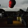
Thanks for the critics and ideas guys, I''ll definitely work on that later on..
hmm.. I agree with the hut.. it''s ugly.. but I don''t know what to add at the right bottom corner.. maybe I''ll just change it with other picture..
thanks againn..
Please give an opinion to my work here..
I dont think you did anything *ugly*, I think it''s just the style of the lines.
Again, do give a try to my tutorial, you might like what you get !
Sancte Isidore ora pro nobis !
Again, do give a try to my tutorial, you might like what you get !
Sancte Isidore ora pro nobis !
-----------------------------Sancte Isidore ora pro nobis !
You know what I think? I think the whole thing looks fine for a "purchasable" product, EXCEPT for the fire, and the grey mask in front of it.
If you would change one thing, work on the firey mask.
Work on making the fire look more like fire (get some reference pics from other games), and work on the grey mask more. Give it more shading and/or detail, that will take it away from looking like a simple line drawing coloured on the computer. Again, get reference pics from games with stone in them or something.
Also smooth up the lines of the grey mask too, they look kind of shakey, and hand drawn (in a bad way though. Hand drawn can be very good, if its a pencil and paper sketch for example, but the mask looks more like it was drawn with the mouse or something)
The hut thing at the bottom looks awesome. The grey mask, by comparison, looks out of place. The grey mask and fire needs to match the quality of that brown hut.
For local multiplayer retro themed games, visit Domarius Games.
This topic is closed to new replies.
Advertisement
Popular Topics
Advertisement


