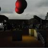
The way it is positioned in the scene looks wrong too...the way it is angled, and also it looks very small compared to the dilapidated building. Try making it a little bigger and move it around so its depth doesnt clash with the other objects in the scene.
Brian
Temple in the Grass (3D)
This topic is closed to new replies.
Advertisement
Popular Topics
Advertisement


