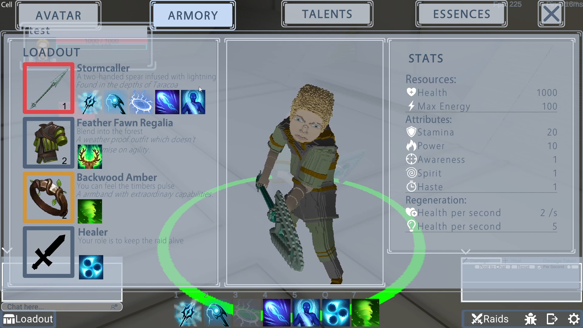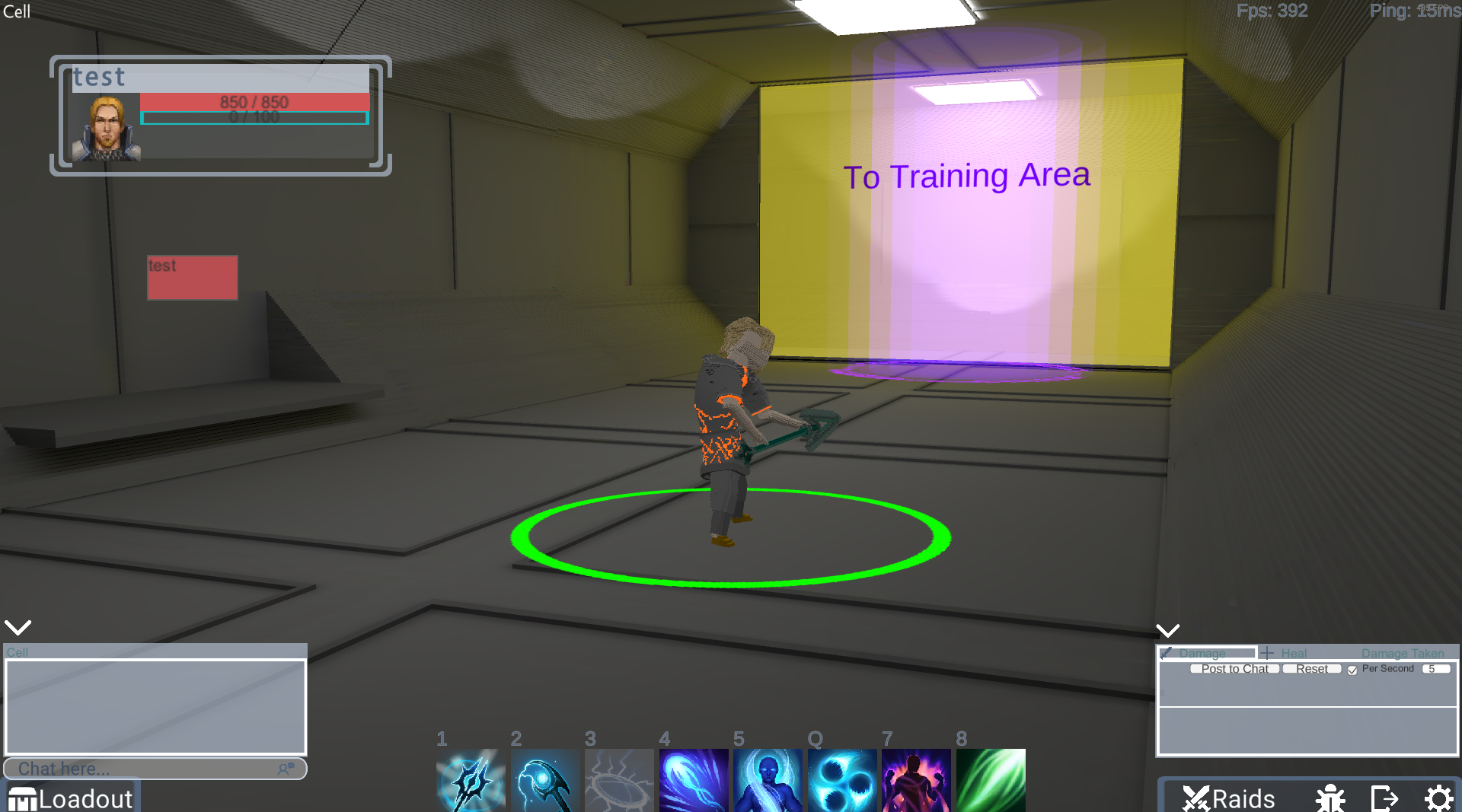
I’ve spent the last two weeks implementing a new GUI concept.
The old design felt confusing and cluttered.
I added more space and hopefully made it more intuitive.
The new interface should conform to the immersion I want to create. The whole game places you in the simulation of a giant corporation named “Raiding.Zone”. This cooperation bought your conscious self. You only live in a simulated environment.
That’s the reason the game places you in a virtual cell. You can meet other players in the Training Area.
Besides this, your only purpose is to fight in Raids for the amusement of the public.

In future updates, I will use this cell to provide visual feedback on your raiding progress.
My plan is to further extend this cell as you progress in Raiding.Zone. I plan to extend this cell the further you progress in Raiding.Zone. There will also be additional rooms to visit in the prison.
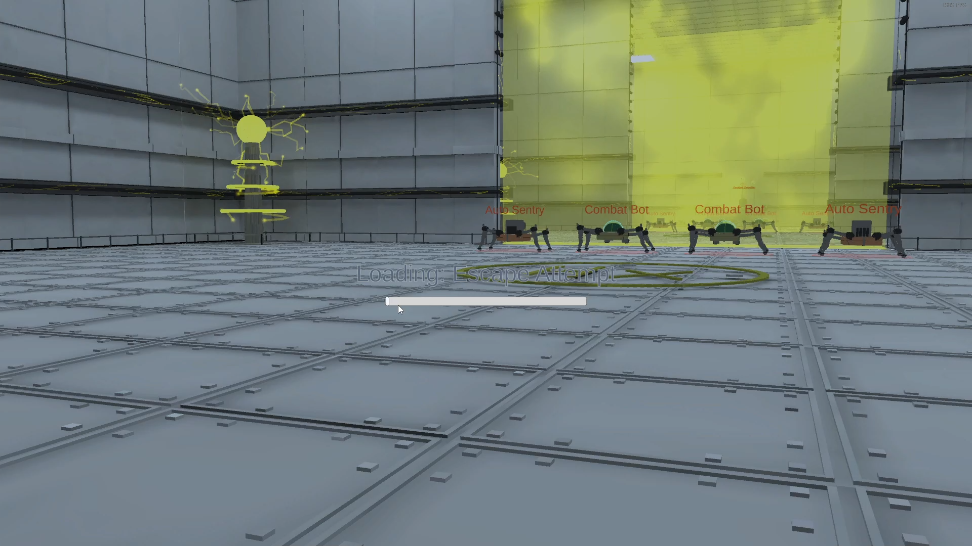
I also added a loading screen picture to make it less boring.


