Hello there, fellow video game enthusiast! This is yet another entry of your favourite Weekly Updates blog!
Last week was a very visual one I have to say. There were a lot of visual upgrades and consequently there's also a lot of pictures, so without any further ados, let's get right to it!
Boost pack upgrade
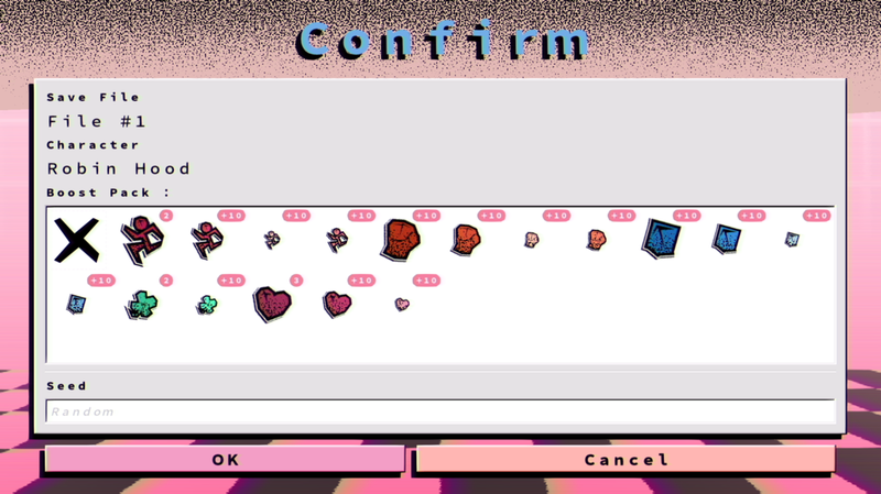
First, let's talk boost packs. I've replaced the previous placeholding designs with something a bit better:

As you can see these boost packs uses my Memphis Design noise mapped to a gradient. I've also got inspired by Kirby Air Ride, of all games.
In it, there's a mode called City Trial, where players race around a virtual city collecting stats altering objects within a time limit in order to prepare for an event chosen randomly.
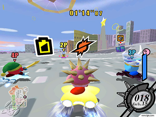
The game mode stuck with me, and so did the actual design of the game itself, So there you have it.
Boost Pack UI
Next, I've previously talked about needing to add some UI elements to let the player choose a boost pack before starting the run.
Well, now it's fully implemented. Take a look:
This screen is shown right before the run starts. In this screen, the player can confirm it's run configurations and, now, select a boost pack if any.
Each boost pack also got a notification pill indicating how many of its kind the player got.
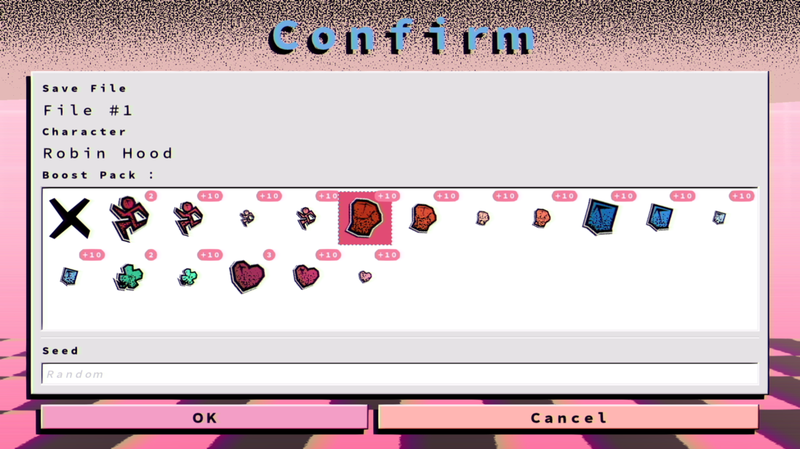
I've also designed the components so that they use a similar highlighting method from Windows 9x, which is to draw a solid coloured rectangle and adding a colour inverting dashed border. It's kinda eye-popping and really aesthetic:
The player can also hover the boost pack to get its name and its description.
If the player doesn't want to use any boost pack then they can select the X (still need to work on this component though) and move on.
Each boost packs are laid out on a grid pattern, and that grid also got a scroll bar too.
New Relic: The Healthcare Card
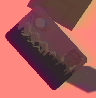
This relic is actually a healthcare card from where I'm from. With it, the player gets the insured capacity.
The Insured Capacity
The player with this capacity will be, well, insured. This means that any attacks inflicted on the player will give him a monetary bonus.
Stats
- LCK -1%
The Super Shoppe
Next up let's talk about the Super Shoppe. It's a new special room that acts as a store selling persistent items such as boost packs or even unlocks.
Its design is heavily inspired by actual malls. (Unlike my malls which are instead inspired by the shops in them)
But anyways, It's a two-story room with an escalator. It also got a nice water fountain with working waterfalls (with shader magic I guess).
Each floor got four buyable items, but the second floor is where the unlocks can be found.
Two of these spawners can also spawn unlockables. Basically, depending on the player's luck, there are three possible items: unlocks, boosts pack or relics.
While the first two types of items are bought with crystals the relics will always be bought with actual money.
There could be many Super Shoppe in one level, and in order for one to be generated the player needs to have at least one crystal in his possession.
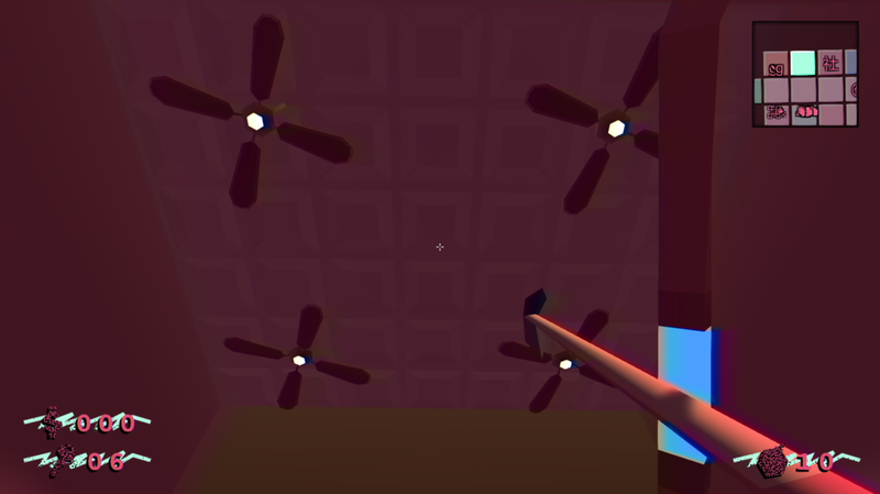
Here's a quick tour of the shop:
Minor Upgrades
- I'm slowly redesigning most of my meshes to match more closely the overall desired design of my game. It takes time but it's needed to have a cohesive world:
- I've redesigned most relics by now, but there are still some other models that need to get touched up a bit...
- Redesigned the Casino Room:
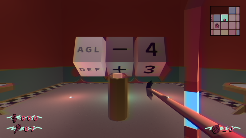
- As you can see how the player uses a button instead of a lever to stop a slot.
- This was because the lever was placed in a place which simply obstructed the slots altogether.
- With the button placed right in the middle, the slots are now fully seen, making for a more enjoyable experience altogether
- Added textures to the carpet and poker tables
- Implemented LOD for each of the casino's decorative card suites.
- Balanced the lights a bit
- Added a light-holding prop hanging from the ceiling
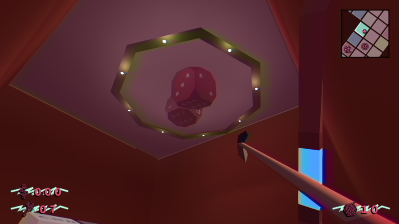
- As you can see how the player uses a button instead of a lever to stop a slot.
- Redesigned the Bank Room:
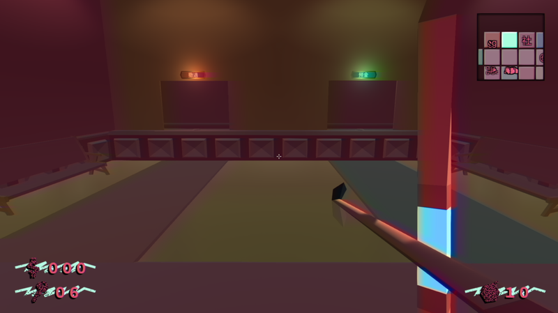
- Changed how the mesh generator deals with special room geometries and whatnot.
- Refactored some of the GUI elements to ease the laying out process to save frames.
Next week
I'm continuing on my redesigns a bit. I'm also planning on working on some light-related balancing to make them just right.
Afterwards, I'm gonna get my head right into Behaviour Trees again. My AIs aren't the brightest and, most importantly, my boss lacks any really meaningful attack patterns. It's also a bit buggy and clearly need to get fixed before any type of demo can be made.
Afterwards, it's your usual suspects (relic, capacities, items and whatnot). I'm also in serious need of localization right now, too (I'm tired of seeing a bunch of "Localized Text Not Found" strings on my UI tbh).
So I still got a bit of work ahead of me, so yeah!


